
The upcoming new Unity shell design for the next release of Canonical’s Ubuntu 11.04 could change the face of the popular Linux desktop as we know it. Canonical creator Mark Shuttleworth is pushing the change to Unity while other Linux distros are rolling into GNOME 3.
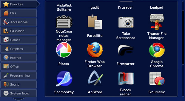
Linux Picks this week takes a look at this new desktop shell for Ubuntu. I have been using the Unity edition Canonical released for netbooks in its Ubuntu 10.10 Remix edition on both my small-screen netbook and wide-screen notebook. For newcomers to Ubuntu or small-screen computers, Unity offers usability advantages over both the Gnome and KDE desktops for Linux.
But for seasoned Linux users, shifting to Unity is a drastic change. It requires giving up your comfort zone and making do with new computing procedures. I have grown to tolerate Unity on the netbook. Using it as the only shell option on my large-screen desktops, however, will make me reconsider switching from Ubuntu 10.10 when Canonical releases version 11.04.
Signing onto Ubuntu 10.10 in the netbook remix version offers users a choice of desktop environments. A panel on the bottom of the screen below the log-in window has a drop-down options list. The choices are Gnome, KDE and two versions of the Unity shell. Not having a similar choice in the next release could force me to avoid Ubuntu 11.04 and beyond.
Precedent Setting
Canonical’s Mark Shuttleworth announced in late October 2010 that Ubuntu will shift to the tablet-friendly Unity interface rather than maintain GNOME 2 or adopt the new GNOME 3.0. He explained in subsequent blog accounts that using one common interface for all sizes of screens and hardware form factors will improve quality assurance. That move will also make it easier for computer makers to integrate and support Ubuntu.
Some Canonical dispatches have since suggested that Ubuntu 11.04 and beyond will make Ubuntu Unity the default offering. But users will continue select their preferred desktop environment.
GNOME 3’s developers are giving that desktop view a new design as well. The Gonome Foundation will release the new version later this year. The Gnome desktop is driven by its GTK+ libraries and has competed for years with the KDE Linux desktop. The K environment runs on the QT libraries.
Unity or More Confusion?
Ubuntu users have been able to run complete versions of the Gnome desktop (Ubuntu) or the K desktop (Kubuntu) by selecting the environment at installation or switching back and forth between environments. They could also run apps from either desktop version in one system or the other as long as the dependent libraries were also installed. To an extent, other distros do the same thing.
Shuttleworth seems to be aiming at a major change in this shell game of sorts. He indicated in his blogs that the next Ubuntu version default install level will have access to both GNOME and KDE libraries. This will make using apps from both desktop systems more seamless and unified. This will still happen with the Unity shell. So it seems that GNOME and KDE will still exist in Ubuntu 11.04. What will change is the look and feel of the desktop environment.
A New Start
I use a variety of desktop and notebook computers that dual boot into Ubuntu and Puppy Linux. To create a sense of my own desktop “unity,” I’ve been using The Avant Window Navigator in Ubuntu and a similar app docking utility in Puppy Linux. See my review here.
To ease my way into using Ubuntu’s Unity shell, I kept the AWN dock at the bottom of the screen. That helped me to adjust to the drastic change Unity presents. I eventually removed AWN and relied on Unity alone. Still, navigating to the apps I wanted to run took some relearning.
My biggest change in how I moved among open programs and files involved the apparent loss of virtual desktops. With the AWN dock running, the virtual desktops were right there on the indicator window. But once I stopped using AWN, I could not find any connection in Unity to switching virtual desktops.
That left me scampering up and down the vertical icon row along the left edge of the screen to find the indicator marker for running apps. It was there in the vertical row of icons that I stumbled upon the Workplaces icon. I clicked it to discover that the center display area showed four smaller screen squares. Clicking on a square brings that virtual desktop to full-screen status. More on this in a bit.
Look and Feel
Unity is much different from GNOME and KDE. Any chance of a similarity ends with the Ubuntu icon in the top left corner. Clicking it is not a portal to the traditional menu list of application categories. Forget seeing any main menu. Instead, clicking on it brings to the center of the screen rows of large icons representing app categories. For instance, the rows fill with Web, Music, Photos & Videos, Games, Email & Chat, Office, Files & Folders, and Get New Apps. Clicking on any of these large icons opens rows of installed apps within that category.
The traditional GNOME panel is gone from the top or bottom of the screen. Instead, a Unity panel sits across the top of the screen. This panel shows navigational arrows and a search window. The additional contents of this Unity panel changes depending on what category icons you click. Also gone is the traditional applications, Places and System drop down menus. No adequate replacement for them exists in Unity.
For instance, clicking the Files & Folders icon brings to the center of the screen a row of recent file icons, a row of downloads present, and a bottom row of favorite folders. These showings grow and change based on your continued opening and closing of menu items in your computing sessions.
As you open additional apps or folders, the list of icons in the vertical row on the left grows. But rather than having to scroll through this list, the icons at the top and bottom of the vertical row fall flat so no scrolling is needed. As you point the mouse at the flat icon, it stands up, allowing the icons under it to slide down for a full view.
Working Virtually
For me, the way the virtual desktops play with the rest of the shell is the deal-breaker. I found it awkward to always have to go to the icon on the left panel to view the virtual desktop grid and click on a square to move to that desktop.
Sure, I could see a thumbnail view of running apps in each desktop space. But not having a workspace grid plainly visible in the panel display slowed me down.
Unity still has the right-click directional shortcuts when I click the title bar of an app window. This lets me move the app to another virtual space easily only when that app is the active window on the screen. But it does not work for apps displayed in the workspace grid display. There all I can do is drag a thumbnail to another square.
Other Shortfalls
I realize that my displeasure with Unity is based on my personal preferences for how I compute. But I subscribe to the theory that if something isn’t broken, don’t try to fix it. I think the Unity design goes too far. GNOME and KDE environments are not perfect. But Unity leaves too much behind in trying to improve the navigational shell for Linux users.
For example, the title bar in open app windows does not have a maximize button. When you click on the minimize button (the only other choice is the X button to close the app), you can’t find it. The indicator bar in the vertical row on the left only shows the same arrow for all open apps or folders. You have to go to the workplaces grid to see it and then click on it.
Also gone is the ability to drag the corners of an app window to resize it. So Unity limits what you do to its preset defaults.
Bottom Line
I like the concept behind the Unity shell. But its execution is lacking. Maybe for a tiny netbook screen, Unity is a good solution. But it seems unnecessary on my larger-screen notebook and desktop computer configurations.
I also found the Unity shell to slow down my system performance. This is true for the netbook running a dinky Atom processor as well as the more robust notebook computers powered with AMD and Intel processors and 3 GB of RAM.
Like I said, if it isn’t broken, why try to fix it? If the GNOME 3 shell is a nice improvement over GNOME 2, I may spend my computing time there.
*ECT News Network editor’s note – Jan. 26, 2011: In our original publication of this article, the image was labeled “Unity.” More precisely, it is the Ubuntu 10.10 Remix version of the Unity shell.













jack, jack, jack…
What the heck you’re talking about?
That is NOT unity, all you’re doing with this article is create confusion on others. Please do your research a little better next time.
The UNR 10.10 release seems like an early stab at the Unity desktop. I found it to be incomplete, much like the initial releases of KDE 4. I think it is quite likely that the Ubuntu 11.04 release will address most of these concerns. Only time will tell.
You are making the assumption (and I think incorrectly) that most distros will go with Gnome Shell. I think that most will stick with GNOME 2.x and move gradually to GNOME Shell. This is what happened with KDE. Most distros stuck with KDE 3.5 until it became necessary to switch.
The second false assumption that you make, IMO, is GNOME Shell will be broadly accepted. You complain that users won’t like the change to Unity because it is too radical. And GNOME Shell isn’t? Either way users will have to change the way they work. Of the two Unity has been around longer and it has the better track record. What it gives Canonical that GNOME Shell doesn’t is control and that is the name of the game.
Canonical can make whatever changes they want. Users can go where they want if they don’t like it. They can also change Ubuntu so that it reflects their personal preference and install either GNOME Shell or GNOME 2.x.
Some will leave, but most users will stick with Canonical. They see it as the front runner and it is innovative and not boring.
My prediction is that GNOME Shell will be the one that annoys more users. I’ve used it and it does not refelct how I work and I think that many users will find the same and I tend to be more of a risk taker than many GNOME users who are by and large don’t like change.
I expected better from a news site, especially one called Linuxinsider. For a minute I thought I was on Neowin, for all the effort that went into this Linux story.
To start off, That screenshot, and what you describe, is not Unity. Never was. That was Netbook remix see, http://www.flickr.com/photos/ncreedplayer/4569270949/ That interface started in 8.04 and was last used in 10.04, aww hell here is the wikipedia page, you must have missed it. en.wikipedia.org/wiki/Ubuntu_Netbook_Edition
Unity, witch was first used on 10.10 was originally designed for netbooks only and was based on mutter. If you were unable to run mutter for whatever reason I think the old UNR interface was the fallback, If your really on 10.10, thats the only explanation I have.
No one is arguing that Muter didn’t work out so good. Witch is why for 11.04 (Yes the version your supposed to be writing about.) they scrapped Mutter and rebased on Compiz. All of this is covered here post.ryanoshea.com/mark-shuttleworth-uds-1010-keynote As well you’ll note Mark talks about how Unity will be a common platform for netbooks and desktops, but they will have different defaults.You’ll also note that Mark says that the "Classic" Gnome interface will still be there for those who are unable to run Compiz. (A much smaller number then mutter.) There’s lots of other good information in there you should check it out.
Your opinions about weather or not Unity fit your workfow are your own. I wont argue them, but I do recommend you try an up-to-date version before forming any opinions and waiting til final release before passing judgement. If you still do not find Unity intuitve, easy to use and overall just getting out of the way. Then bring something more to your argument "if it an’t broke…" its tired. Many users are not so resistant to change.