
It’s no wonder that the Linux desktop operating system is not attracting hordes of new users from Microsoft Windows and the Mac OS X platforms. Linux has almost too many desktop choices, and most of them are far from good.
One clear exception is the Lightweight X Desktop Environment, or LXDE. I am becoming increasingly enamored with it as the near ideal Linux OS desktop environment.![]()
Consider the other choices. Developers continue to monkey around with the functionality of Gnome 3 and KDE 4 desktops. The upcoming version of Ubuntu will sport a new heads-up display (HUD) that will take its Unity desktop further afield of many users’ comfort zone. And the newest kid on the block, the Cinnamon desktop, may be too spiceless to fix what is broken on Gnome and KDE desktops.
On the other hand, LXDE blends a nice balance of aesthetics and performance. It has been growing in popularity since first introduced in 2006. Its community seems to have succeeded in designing a fully-functional desktop with a lightweight yet powerful desktop manager.
Performance Counts
I have put LXDE through a variety of challenges on a bevy of desktop computers, laptops and netbooks. Only one of the computers was built around the latest family of hardware niceties.
The other units ranged from two to four years of slower, older components. One machine especially groans when I attempt to run the latest versions of Ubuntu and Linux Mint under iterations of Unity, Cinnamon, unfettered GNOME 3 and revamped KDE 4.
But one performance factor is indisputable. All five of my computers consume less CPU and RAM running LXDE under both Ubuntu 11.10 and Linux Mint 12 than any other desktop environment. And they all share yet another common characteristic.
LXDE performs nearly as fast on all of these configurations as does Puppy Linux on the same gear. This is quite significant. Puppy Linux loads into available system RAM. So firing up applications and processing data is humorously fast.
Look and Feel
LXDE at first blush closely resembles other X window managers tweaked for popular Linux distros. But the LXDE Project picks up with functionality where the Xfce Desktop leaves off. Xfce, another lightweight desktop environment, in my view is a bit kludgey compared to LXDE.
The default graphics in LXDE might be a turnoff for some users. But the goal is not to have lots of eye candy that bloats the concept of a lightweight desktop. So if you do not insist on a fancy photo display as your background, LXDE can work fine for you.
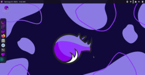
For example, the desktop background image is clean and fresh-looking. It displays the project’s logo in the right center of the screen. What appears to be a bird in flight forms the shape of the X in the LxDE image. Colors come in three gradient choices: blue, red and green.
Bar None
The menu bar for Linux users is a staple that newer desktops want to do away with. Not so here. LXDE has a traditional panel which is easily configurable with about a dozen options.
It sits at the bottom of the screen. In fact, one of the options lets you add another panel on the top edge of the screen. The panel contains a menu button, default application buttons for file manager, terminal window and Web browser as well as a button to either iconify or collapse all windows.
You can add or remove panel elements with a click of a check box. That includes setting up or removing a system tray. In fact, you can place it anywhere you want on the panel. Options for content within the system tray include a CPU monitor, screen lock, power down button and clock.
LXDE includes the Open Box window manager. Access to its configuration manager is found in the Preferences menu. You can also reach it by right-clicking on the desktop.
Menu Mania
I like the easy flow to the menu system in LXDE. It works like you would expect in more traditional Linux configurations. A single left click on the menu icon to the far left of the panel bar pops up the menu category list. Hovering the mouse pointer over any category opens the menu to expose the installed apps.
Another click on the application’s name loads that program. It could not be any easier.
A handy feature is the ability to right-click anywhere on the desktop. This opens a basic systems menu that provides access to a terminal emulator, Web browser, virtual desktop navigation, OpenBox Configuration, system restart and exit.
Missing From Action
As part of the lightweight design, I suppose, two features are missing from the LXDE’s bag of tricks. One of them is the ability to use the panel as a launch bar. The other is a menu search tool.
I can live without these two menu tools. But the launch bar concept is a functionality that I would like to see added to LXDE. It would provide a handy convenience, for example, to have the launch bar in a second panel at the top of the screen.
I have not found the menu search tool to be of much use. By the time I remember the name of a program I want to launch, I could find it in the menu.
Have It Your Way
Do you prefer using desktop icons to launch applications rather than scrolling through the menu? With LXDE you never have to choose one method over the other.
Being able to place app icons on the desktop makes up for not having launch bar capability. I rely heavily on virtual workspaces on the Linux desktop. LXDE gives me the ability to set up workspace switching with the click of a window on the panel bar. And I can move from workspace to workspace without taking my fingers off the keys.
The alt/tab key combination makes it easy to switch among open windows on the same workspace. The ctrl/alt/arrow keys enable jumping from workspace to workspace.
Bottom Line
LXDE is convenient, fast and reliable. It offers a near perfect alternative to navigating the Linux desktop. It does this without having to make multiple clicks or suffer other slight-of-hand tomfoolery that is built into the more bloated desktop alternatives.
LXDE is aesthetically pleasing without resorting to system-hogging eye candy. I’ve tried the rest. I keep coming back to LXDE as the best desktop environment choice.













The lack of menu search tool isn’t as serious because it could be done by using the ‘xfce4-appfinder’ which also works fine under LXDE. What I’m missing much more are system tray monitors for net-, harddisk- and memory-usage. Further it’s boring that desktop-icons couldn’t be sorted / arranged manually. But even though LXDE is a nice desktop environment because of it’s low resource-consumption. But actually I still prefer XFCE cause of the lacks mentioned. Perhaps sometimes they will be fixed / expanded…
LXDE has been great for quite a while. It’s not about search mechanisms, it’s not about a ton of stupid shortcuts; it’s all about CUSTOM stuff YOU want so you create the shortcuts yourself.
If you’re going to build a PHP-VBox Hypervisor, you better have LXDE running. It’s the only way to have great clean shortcut fun to the tools you need to run your visor.
I know what you mean about using the panel as a launch bar. LXDE sacrifices some easy to do things like drag and drop in order or remain lightweight. But here’s how I add applications to the LXpanel.
Right click on Panel,
Panel Settings (tab),
add (button),
Application Launch Bar,
Add it in, it should be blank when you do. Right click it on the panel and (settings) from here you choose an entry from the Menu and done! It’s a heck of a lot more steps from Gnome, but meh you only do it once anyways.
Besides that LXDE is still great for those of us who always prefer speed over looks.
"..missing from the LXDE’s bag of tricks. One of them is the ability to use the panel as a launch bar"
Maybe I am not understanding but if you add menu entries (either by creating a desktop file or by using lxmed) then you can include them in the ‘application launch bar’ entry of the panel.
Agree with you about LXDE (i am using Lubuntu). A few rough edges but much promise. Doesn’t get in the way.