
![]()
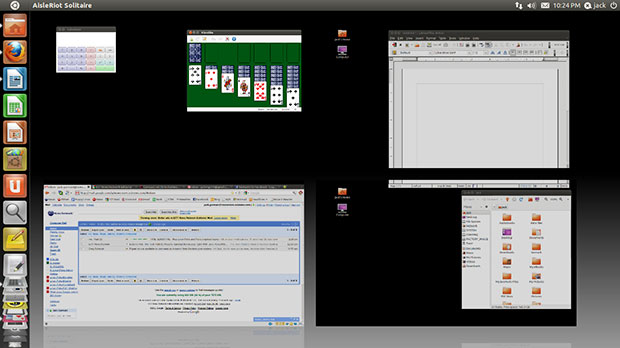
My reaction to the latest version of Ubuntu can be summed up in just three words: Far from awesome! That impression largely results from the switch to the new Unity desktop.
Canonical, the developer of the Ubuntu Linux operating system, released version 11.04, also known as “Natty Narwhal,” on April 28. This latest version marks the official roll-out of the redesigned Unity scheme as the default desktop. The company first designed Unity as the preferred interface in its Netbook Remix in the version 10.04 release.
Now, however, Canonical retired the Remix version for netbooks in favor of a one-size-fits-all Unity shell for desktops, notebooks and netbooks. But at log-on, you can opt to run the Ubuntu Classic GNOME shell on any form factor instead of the Unity desktop. That same option, once you install it from the package manager, exists for KDE (Kubuntu) and Xfce (Xubuntu). But if you choose GNOME, you will have to settle for version 2. Natty Narwhal’s developers will not have GNOME 3.0 integrated for several more months.
For me, having the ability to reject the default Unity desktop environment makes the difference between leaving Natty Narwhal behind and keeping it. Still, it’s a half-way measure that requires a minor tweak. If you do not require a password at log on, you will have to first log off and begin a new session to get that choice of desktops. The options are available in the Sessions menu under the password box on the standard Ubuntu log-on screen.
The Good
Since the big news rests with the Unity desktop, much of this review on Ubunu 11.04 will focus on how Unity works or doesn’t. But first, I want to emphasize that Natty Narwhal provides faster boot-up and snappier performance than the previous versions.
Another really impressive quality built into Natty Narwhal is the 3-D effects with overlapping windows. This view is far more appealing than a flat-surface overlap.
Overall, the Unity interface is a radical change in desktop navigation. It offers a fresh approach to working with application windows. It is streamlined and goes where no other Linux distro has yet to travel.
Bad Start
This is the first new version of Ubuntu in a long time that fouled up my computers. First, it was a messed-up grub config file. I could not boot into other partitions to run other operating systems. The symptom of a corrupted upgrade was the message floating around the screen at boot up saying that “Input Not Supported.”
Once I fixed that issue, the settings defaulted to previous version choices. Even worse, I could not get rid of the Kubuntu desktop options. When I ran the Gnome version at log-on, everything was broken.
The only sure cure was to download an ISO, burn it to CD and reinstall the upgrade from scratch. That at least cleaned out the clutter by replacing the faulty 11.04 upgrade and a series of files hanging around from version 10.10 The option I selected deleted the upgrade and re-installed 11.04.
Quick Fix
The GRUB boot manager was still blocked. The upgrade process rewrote the display values that the boot loader uses. So I had to edit the config file yet again. Similar issues presented themselves when I upgraded other computers to Natty Narwhal. I quickly figured out that it was safer and quicker to do a clean installation rather than an upgrade.
Fixing the problem takes some editing of boot manager configuration file in a text editor. To get there, you need to use a terminal window and enter a few super user commands (Sudo). Here is the process:
- In a Terminal window, type > sudo gedit /etc/default/grub, then press the Enter key and password when asked.
- Then press the Enter key. This displays the GRUB config file in a gedit text editor window. Do not yet close the Terminal window.
- Find the line #GRUB-GPXMODE=640×480 and delete its preceding # symbol to activate the line. Next, change the number values to 1024×768. Now save the file and close the gedit window.
- In the Terminal window, type > sudo update-grub, and then press the Enter key.
This process worked fine — except my configuration file had a line referencing GFXMODE instead of GPXMODE. But the fix worked just the same.
Look and Feel
The Unity interface does not use the classic GNOME panel. A similar panel is still on the top edge of the screen. But it does not function as a launcher dock. It has the same notification icons on the right end.
Rather than seeing a menu drop-down list when you click the Ubuntu icon at the left edge of the panel, you get a search box. Start entering letters and program icons with those letters in their names appear on the screen. The viewing field is transparent so you can see a shaded desktop background image under the search results. The results also include programs and folders and their contents related to the search term.
Click on the icon in the search results list to launch that program. This is a more efficient way to find an application to launch than scrolling through a list of categories and then a sum list of app names.
The most challenging change in the look and feel of the Ubuntu Linux desktop is the Unity menu bar. This is a vertical panel on the left edge of the screen. It combines what used to be the separate functions of the Ubuntu menu button and the panel. It shows icons for default programs and running applications.
How It Works
The icons fold flat at the top and bottom of the bar as more icons and open apps are added to the computing session. Placing the mouse pointer anywhere in the panel stands the flat icons up. The panel icons scroll as you move the mouse pointer up or down over the icons.
Right-click on an icon to open a brief options list to keep an open app’s icon in the panel. Do the same thing to remove an existing icon from the panel or close the open app.
Earlier versions of Unity offered a Favorites folder. Scratch that from Natty Narwhal.
Natty Navigation
Making your way around the desktop in Natty Narwhal takes some effort. No unified menu listing exists. Instead, you view sections of applications in horizontal rows on a full-screen display. You get this feature by clicking on the Files and Folder or the Applications icons in the vertical panel. To clear the desktop display, click the Ubuntu icon at the left end of the top panel.
The top rows shows Most Frequently Used files and programs. The second row shows Installed apps. The bottom row shows related Apps Available for Download.
The first two rows add a See More arrow. Pressing the arrow adds more rows of app icons and names.
The very top of the screen displays a search window. Start typing a program name to see if the program is installed or available for download. The only semblance to the previous program listing system is an arrow on the far right edge of the search window. Clicking on this arrow opens a drop-down list of program categories. But selecting a category changes the full-screen display to program icons found in that category.
Missing Stuff
Applications tweaked for the Unity interface do away with the traditional minimize/maximize buttons. Others applications still have them. I suspect that future distro software updates will replace older versions of applications to the redesigned version with no minimize/maximize functionality.
Show me the desktop! Nope. You can’t go there. Version 11.04 of Ubuntu no longer has that quick-action icon to minimize all open app windows. But then, you have little need to go to the desktop. Desktop icons no longer live there.
Something else that is missing from the Unity desktop is the ability to roll up a window so only its title bar is visible. Not having this functionality is one more handy navigational tool that no longer exists.
Design Oddities
When you minimize a program, it stays on the program panel that pops out from the left edge of the screen. But gone is the ability to resize Windows on any application that does not have minimize/maximize buttons.
You are stuck with full screen or hidden (aka “minimized”). Also gone is the Alt/Tab window-switching functionality.
Open too many applications and frustration can appear instead of all the open app windows. At least that was my experience.
More Oddities
If you open a second app in a virtual workspace that already has an app running, some of the windows share the screen real estate equally. But other app windows overlap paired windows in background. The foreground window is faded and partially transparent.
For example, two apps opened in windows that equally shared the screen. When I opened a third app, its window was transparent and centered on top of the two previously opened windows.
A fourth opened app filled the entire screen. I couldn’t switched among the open apps. I could scroll through the vertical panel looking at the icons with arrows pointing to them to find open apps. But that didn’t tell me which apps were on what workspace.
The only partial solution is double-clicking the full-screen window’s title bar. That action slid the full-screened windows partially off the right edge of the screen to reveal portions of the other windows beneath it. That let me click on a portion of each visible window to bring it to the foreground, overlapping other windows.
Menu Bar-Ify
Clearly, Ubuntu’s Unity desktop is going to produce a love-it-or-hate-it reaction among users. Put me in the Hate It category. I did not like Unity in its earlier iterations, especially on the Netbook Remix version. I like most of its features — or lack of features– a lot less now.
The biggest quandary I have with Unity is what it does to menus. This is especially the case with application menus.
For instance, most program windows must be full-screen before you can access the app’s menu row by placing the mouse pointer on the title bar. If you double click on the title bar to shrink the app window or otherwise resize it, you can not access the menu. Usability-wise, this makes absolutely no sense to me.
However, a nice touch is the hidden menu bar on Unity-optimized applications. For example, touch the pointer on the left half of the blank panel to access the drop-down menus for File, Edit, View, Places and Help.
This is a bit strange. the menu row does not appear on the title bar of the opened application. So it takes getting used to see a blank bar on the application’s window but the menu options on the panel bar above the window.
Bottom Line
Natty Narwhal will no doubt bring users a fresh style to their Linux platform. Better performance factors aside, this redesigned version will give Ubuntu fans a unique reason to upgrade.
When you make the leap to Ubuntu 11.04, be prepared for a bit of a learning curve. Only time will tell if dedicated Ubuntu users will take to the Unity default desktop or will revert to the Classic Ubuntu desktop option. That could become more of an issue when Canonical adds GNOME 3.0 to the mix.
















i tried unity in pre-release. i expected bugs, and found plenty of them. tried again after official release and was just as disappointed. this will not move consumers from windows, and only frustrate ubuntu users. i went back to 10.04 where everything works the way it should. if gnome 3 is similar to unity, i will be looking for a new distribution. not ubuntu. i like compiz/config which is not supported on my computer in unity.
IMHO
a)Natty was not awsome as promised, because Unity was presented on 10.10 Netbook remix and many of the bugs that presented are only fixed for 11.04. Many of us saw a desktop full of shortcomings, when on the other hand Gnome was fully functional and plenty of customizations.
b)Unity want to propose a diferent desktop, but without full Gnome Community support (they are working on Gnome3 too), the efforts of Unity team looks very weaks. I we add the lack of customizations, it loose the "Linux touch", turn it into a boring desktop.
I hope that Unity and Gnome3 could "live" happy together as two options of desktop, on incoming releases (Or it could be one of the biggest headache of Gnome users).
The Unity desktop definitely presents a learning curve. I think it would be excellent for a netbook or tablet but I just didn’t find it (personally) usable for a desktop environment. I didn’t like the lack of maximize/minimize buttons on the windows and being unable to resize a window. Who honestly thought this was a good idea? I’m a newbie to Linux from the Windows world and while I like new GUIs, this wasn’t one of them. Sure, it had a lot of eye candy but I was anxious to get some work started on a Linux system. I could understand KDE and GNOME and move around well but Unity was just too much of a departure. I ended up going with Linux Mint, am very happy with it and was able to get my system up and running fairly quickly
Folks, I do like new things and want to try them, but it seems like everything I want to do in Ubuntu 11.04 with Unity requires a 2 hour google adventure with the command line and exotic fixes. arrgggg!
I especially hate the file menu showing up all the way at the top of the desktop. My 1920×1080 32-inch monitor requires me to mouse all the way up and then allll the wayyy down to use the menu. The is serious time-suck! Who the heck was the usability engineer on this?
The search box is horrible, I don’t remember the name of all the software I have installed, I need to see a full list, and not with large icons everywhere, I’m not that blind yet.
I will be switching back now to the old desktop that I know how thanks to this article. I feel like I have come off a terrible Canonical-roller-coaster when all I did was hit a single "upgrade button", sheesh.
PS on the article:
–You can get to the Desktop via Mod-D (windows_key-D)
–minimized windows do not make send in unity, period.
I haven’t had any problems with Unity and I actually really like the interface.
Unity seems to me a child only its mother could love. I came to Linux from Windows about two years ago, but I had less trouble adapting to Ubuntu 9.04 than I would have had with Unity if I were a newcomer today. I see no way that a two-foot-wide version of a phone screen can be a useful desktop navigation system!