
![]()
Having multiple choices of desktop environments is one of the Linux OS’s strong points — as well as its potential nemesis. This lack of a uniform desktop strategy means confusion for Linux newcomers and frustration for seasoned users.
For example, the two most used desktop environments are GNOME and KDE. But the choices do not end there. Add to the fray Xfce and LXDE and more bare-bones systems such as FVWM and IceWM, among several others.
And then you must factor in a handful of X Window managers that handle the windows that applications bring up within a desktop environment. They also control how Graphical User Interface (GUI) icons are displayed and organized on the desktop.
I have had a love-hate relationship with GNOME (See my review of the new GNOME here) and KDE. I run various versions of both desktops on my collection of desktop and laptop computers. But the more I play around with the latest version of the KDE 4 desktop, the more I yearn make the attraction more than a one-computer affair.
KDE version 4.6.1 is more user-friendly than earlier 4.x versions. This latest release is also much better than what I liked about the KDE 3.x lineage.
The View
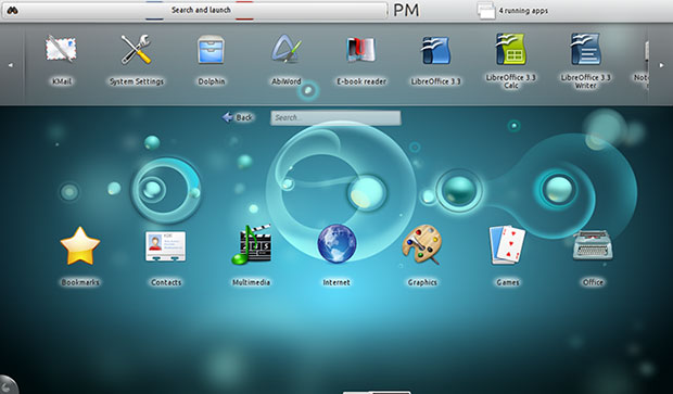
The KDE community dubbed KDE 4 “The Plasma Desktop Shell.” One look at the splash screen and the Plasma theme shows why that term is so fitting.
It has four layout settings. The Newspaper Layout puts widgets into columns. Folder View displays folder contents with the user’s home folder as the default. The Desktop layout shows a more traditional default view of panels and menus. The Search and Launch layout adapts the search interface into a full screen application.
You can also set wallpaper and position it six different ways. Mouse actions are also configurable much more so than in earlier KDE versions and in GNOME.
Available options are middle button, right button, vertical scroll and add action. Actions include launching applications, standard menu, past, and separate switches for window, activity and virtual desktop.
Getting It
Check your distro’s forum instructions for targeted directions. The process is similar among users of Suse, Red Hat and Ubuntu, as well as the numerous offshoots of each of these mainline Linux distributions. Generally, if your distro had KDE 3.0 available, a desktop upgrade is or will be provided through the repositories.
Here is how I did the changeover to KDE on my Ubuntu-powered computers. Enter these commands in a terminal window. Do them one at a time and wait for each process to complete.
sudo add-apt-repository ppa:kubuntu-ppa/backports
sudo apt-get update
sudo apt-get install kubuntu-desktop
sudo apt-get dist-upgrade
An Install Overhaul
It took about 30 minutes to download and install the KDE 4.6.1 desktop on each of three computers. Expect a snag or two along the way.
For example, with my older laptop on reboot, the system hung between the sign-on panel and displaying the desktop on the screen. I had to press the power button to reboot. The second attempt was the charm.
On my off-brand netbook, the process caused some minor anomalies that I corrected by modifying a few system settings. The biggest annoyance was getting the screen resolution to display properly. I finally changed the selection at bootup from the netbook option to the standard Plasma Desktop setting. Problem solved.
I experienced the smoothest upgrade on my newest desktop computer. Everything worked as expected the first time around.
Annoying Things
Several performance quirks irritate me with KDE 4.6.1. I found these conditions existed in varying degrees of severity on all three computers. I suspect that KDE is just not as rigorous as GNOME in sensing variations in hardware.
For example, on the laptop I did not have access to already-installed software from previous GNOME installations. That did not happen on the other two installations. Before I installed the KDE desktop, my laptop computer had both OpenOffice and LibreOffice suites installed. After the installation, neither one appeared in the menus or in the KDE Package Manager list of installed applications.
I exited the KDE desktop and logged in under the GNOME desktop. Still no office suite packages were in the menu. But they were listed in the installed list of programs on that side of my Ubuntu 10.10 Linux installation. I had to completely uninstall both packages in the GNOME desktop and then install each one as a fresh addition. When I returned to the KDE desktop, all was well.
More Dismays
Another big annoyance is the unresponsiveness to some system commands. Again, this did not happen on the desktop computer.
For example, running some software updates requires a system restart. I click the restart button and receive a confirmation beep. But the system does nothing. I have to manually shut down the system and restart it. Still, this problem is sporadic on just one or two of my computers.
I like to tinker with hardware and software. Working with new applications and delving into different desktops is an acquired skill for me. But I found my first few days of using KDE 4.6.1 a bit frustrating. It took a lot of trial and error figuring out how to use new features such as Activities and virtual spaces.
Note to KDE developers: Add a text file with quick tips or quick-start helpful hints. Some of the new features and enhancements require a heads up.
Gooey GUI
The desktop interface for KDE 4 takes some getting used to. It has a large block background that holds the components of the application launcher when the KDE button is pressed in the far left corner of the panel on the bottom of the screen. Separate icons at the base of the index box slides a list of Favorites, Applications, Computer (System) and Recently Used programs. A large red Leave button shuts down the computer.
The other end of the bottom panel holds icons to show desktop, a notification area, clipboard contents, volume control and battery/power meter. A pop-up arrow shows other system access functions such as a printer applet, Bluetooth, Device Notifier and Message Indicator. The traditional virtual workspace switcher rests near the left side of the panel.
You can check a box when downloading new packages to always accept the authorization password. This is a nice touch not found in the GNOME shell. But it is pushing the safety feature a bit, so really think about giving the system blanket approval.
Clicking the corners of the screen opens other action menus. For instance, click the circle in the upper right corner to open a tool box for configuring options and controls. Click the lower right corner to access panel settings.
Widget Wonderland
Right clicking the desktop pops up a variety of commands. Included are Run, Add Widgets, Add Panel, Activities, Leave and Lock Screen. A series of right click adds new activity pages and templates for other activities. These include widget choices that you click and drag to place on the activity page.
These widgets are much more refined than widget usage on the GNOME desktop. With KDE the widgets become closely integrated with the desktop environment. In GNOME, widgets are clearly bolted onto the environment. This makes using them less seamless.
For instance, dragging a KDE widget to a desktop page makes it a functioning app window independent of other widgets on the page. I especially like being able to place an application launcher on any page. This launcher widget is a clone of the pop-up menu system available from the desktop panel.
The launcher widget even has a quick search bar on the top of the index box just like the original panel index system. However, the add new widgets feature failed to download any new items on any of my computers.
Focused Review
My focus here concentrates on the shell functionality and desktop appeal of the KDE version 4 series over the long-time standard set with KDE 3. The KDE community released version 4.6.0 in late January. The community released version 4.6.1 a few weeks ago as the next step in polishing the earlier releases in the 4.x series that brought improvements to applications and shell.
One key element in the 4.6.1 innovation is the resident file manager, Dolphin. Now you can search within Dolphin to find indexed files more quickly. A filter side bar lets you find the file types you want by file type, creation date or rating. This new view is called faceted browsing. These filters can help you find specific files in folders that have a lot of files.
Another big deal in this release is the new capabilities of the virtual workspaces. I consider myself a power user of virtual work spaces. KDE Workspaces use what developers dubbed “Activity Page” designs.
I like the improvements a lot. I can have separate multiple desktops with a unique purpose and design for each one. For instance, I can have different widgets, wallpaper and applications associated with each workspace.
I have grown fond of the eye candy that comes with the Compiz graphics on the GNOME desktop. Now this functionality is getting better in KDE.
More Nice Touches
I also like being able to detach items in the notification area and dock them elsewhere on the desktop. Another cool tool is the notification popup’s new meter showing the speed of the download.
The docking taskbar lets me pin tasks in the taskbar. This turns them into smart launchers.
Settings have been split into two categories now. They are arranged into Global Settings and Power Profiles. Lastly, the keyboard shortcut Super and Tab keys switch between activities easily.
Bottom Line
The latest KDE version is well worth moving from its GNOME counterpart. This may become even truer once the GNOME 3.0 upgrade becomes mainstream. You can do a lot more tweaking with KDE now.
Still, KDE 4.x will not satisfy all users. [*Correction – April 1, 2011] If you try it and do not like it, a simple selection change at sign on easily reverts to the GNOME environment.
*ECT News Network editor’s note – April 1, 2011: In our original publication of this article, it is stated that “GNOME 4.x will not satisfy all users.” In fact, the author was referring to KDE 4.x, not GNOME.




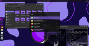








You can easily just install Xubuntu, then use all your favorite Gnome or KDE components.
For example, I use the Dolphin file manager in it, along with gnome components such as Gedit and Gmusic browser.
The main menu and settings managers in Xubuntu (I call it MIGHTY MOUSE myself) is infinitely customizable and will bring up everything you need for all three environments, or components thereof.
All this after simply checking two boxes in the Xubuntu Settings manager to enable all KDE and Gnome components!
I see no reason to install just one environment on a modern machine (faster than 2GB processor with 2GB ram) and, indeed, the latest "unity" or "plasma" just don’t do it for me anyway.
As far as I understand it, Ubuntu has a bad history with their KDE implementations.. I can see how you had so much trouble. But your experience is very limited to just "your" distro and not even fair to KDE…
I suggest you get your hands on OpenSuSe 11.4 By far the best KDE distro around, or Mint even. Though OpenSuSe runs just about every desktop, they focus on the integration and usability alot more.
I dont think anything that you wrote about the problems with KDE are accurate. I’m running it on a lil Samsung NC10 Netbook with 1 gig of RAM (four virtual desktops, widgets, effects), I have not noticed any slow down or major issues. I admit to crashing it while messing with activities… but that was my doing while pushing my lil machine to its limits.
Be fair and accurate when you review a product of any kind.
I use the keyboard a lot inside of KDE… check out "Shortcuts and Gestures" under the Personal settings section. Also, you can press ALT+F2 to bring up KRUNNER, which allows you to navigate windows, desktops run programs or even search the net (wiki google et al) just by typing their name… KDE is configurable to a hectic degree. I even hide typical programs I run (like console and chat) from the taskbar and enable shortcut keys to them.
And have they done anything yet for those of us who prefer to work from the keyboard rather than the mouse?
I would love to move from GNOME to KDE; the application richness under KDE is so much better. Unfortunately my work is slowed down so much by having to continually reach for the mouse that this currently isn’t an option.
No. It was not the netbook version. I installed the full version on all of the hardware I referenced. I am running the same version of KDE 4.6.1 on the desktop, the laptop, and the netbook. The netbook version has a slightly different interface, but that is not the version I reviewed.
Best regards, Jack M. Germain
I am a KDE user and it looks and sounds like you are actually reviewing the "Netbook" version of KDE 4.6.1 If that is the case, you might want to clarify that for the readers.