![]()
If your work routine at all resembles mine, you probably have little or no time to squeeze in new appointments or run unscheduled errands. That is where the GnoTime Tracking Tool can save your work day and probably much of your night time as well.
The Gnome Time Tracker comes close to doing it all. It works as your to-do list. It can serve as your diary or work journal. Even better, it can track how much time you spend on projects. If those functions do not qualify GnoTime as the Linux killer app of the year, then maybe its ability to generate reports and invoices based on that time log will.
When it comes to tracking what I do and when, I have yet to find a Linux app that measures up to the productivity I get from GnoTime. It is a shopping list keeper, an idea organizer and a bug report tracker. It is a great tool for keeping track of Linux apps I find and test as well as keeping tabs on a publishing list of upcoming due dates for all of the projects I handle.
Did I mention it is also a great way to provide ongoing status reports? I have used lists in word processors, charted details in spreadsheet grids, and formed cells in database managers to track one or more of these activities over the years. GnoTime has the flexibility of doing all of these projects as combined or separate projects.
Several weeks ago I reviewed a basic, no-frills tracking tool called “gTimelog.” It is a great bare-bones approach to logging what I do when I work. GnoTime comes with all the bells and whistles that give me a full feature set of tracking tools for reporting, billing and tracking ideas and projects.
No Plain-Jane Look
The Graphical User interface (GUI) in GnoTime takes some getting used to. This is especially the case if you keep a lot of open panels showing. I segregate different running applications to their own workspace on the Gnome desktop. So filling up an entire screen with multiple GnoTime elements is not a problem for me. But you can just as easily minimize one or more windows and work on a single desktop.
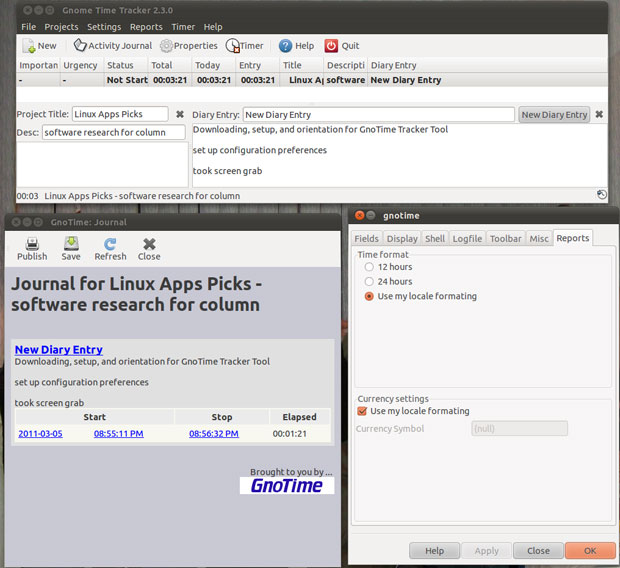
The top row of the main application window is typical of a traditional GUI design. But the similarity ends there. Access to all program features is available from the top row of drop down menus. A limited tool bar provides quick access to some of the same functions. The categories make a lot of sense.
For instance, features fall under File, Projects, Settings, Reports, Timer and Help. You can control how much displays in the various detail windows with check boxes in Settings/Preferences. Ten functions are available from the Reports menu. These include To-Do, Status, Invoice and Journal. The Timer menu holds the stop/start control for the stop watch. I love the full user manual that pops up in its own fully searchable window from the Help menu.
A limited tool bar row is located below the drop down menus. You can click icons to open a new entry, Activity Journal, Timer stop and start, Help and Quit. These serve as default short cuts to the most essential menu options.
Busy Interface
Tracking several projects fills in a lot of data in the various display panels of the main application window. For instance, the currently active projects display in a large window under the tool bar row. It shows details that include: importance, urgency, status, total time spent, current working time, project title, description and new diary entry,
Each line contains the summary data for a particular project. Click on a project line to see more specific data in two resizable panels under the project summary window. The Properties menu opens a tabbed panel that lists Projects, Rates, Intervals and Planning. Each tab has even more precise billing and time tracking options to regulate calculations for billing and reporting.
The Journal panel is a dizzying array of links to other panels and windows in the tracking system. The Journal panel presents a series of diary entries. Each one can be a short or long note about a project, a ToDo list entry or any comment you want to add to the mix.
The Journal lists each entry as a hot link that shows in blue the date of the entry and the starting and stopping time of the item. Elapsed time is shown but is not a link. Clicking on any of the linked elements opens a larger window with the related details.
Data, Data Everywhere
The computer screen can quickly fill up with overlapping panels and windows as you work your way deeper into the overlapping tracking elements. The overall process can become a bit confusing. No matter what panel options I open, it is labeled as GnoTime: Journal.
For example, one of the handiest features is the Invoice Report option. The program tracks billable journal content for each project and activity. The Invoice window shows a list of entries that resemble a spreadsheet window. The data shows Work Item, Billing Status, Billable/Not billable, Bill Rate, Total time, Value and Billable Value. That is a lot of stuff the program handles automatically.
Select Reports/Query to open the Custom Report Generator for the active project. Then select from the drop-down menu which custom report report you want to generate. The options are Journal, Big Journal, Invoice, Daily, Status and ToDo. You can refine the date range for the compiled data. Or you can select a Daily, Monthly, or Custom activity report. When you have completed all selections, click the Generate Report button. The results display in XML file format in yet another window that pops open.
More Cool Features
The ability to maintain multiple To-Do lists is a deal-maker for me. I can sort each list by the priority or importance of the tasks. This is a huge advantage over having tasks for different activities scrunched together in one list manager.
I can keep long and detailed notes and diary entries in their own Diary/Journal areas. Project descriptions and status comments can be as long as I need. Plus, the diary area lets me make day-to-day notes associated with a set of timestamps. That allows the program to keep a record of what I did on any given day in all of my tracked projects or activities.
The Running Timer tallies time totals for each project or task viewable by day, week, month or year. It measures the amount of time that I sit at the computer actually working. For me that is a big bonus, as I often multi-task without leaving my swivel-chaired work area. When the keyboard or mouse is idle, the clock stops. If it stays stopped for too long, the program nags me to start it up again.
Bottom Line
The Gnome Time Tracker is a very flexible and comprehensive tracking toolbox that auto-saves as I work. Despite GnoTime’s propensity for desktop clutter, its interface is simple to use.
It is overkill for casual users. But if your work day is consumed with ongoing projects and activities that need frequent minding, this Linux App is a best-in-class winner.


