
![]()
The release last month ofElementary OS Freya version 0.3.2 showed little has changed in this new-style Linux distro that wraps its own lightweight desktop design around the Ubuntu core.
Elementary OS first appeared in 2011. I last looked at its Freya beta release in 2014. I liked its fresh, new look and simplified approach to desktop management. However, my hopes for more features and a faster-evolving desktop environment in the latest release went unfulfilled.
The developers of Elementary OS built a new, slimmed-down desktop environment that blends some of the better characteristics of the Chrome OS, the GNOME 3 shell, OS X’s design consistency and the Ubuntu underbelly. Oversimplifying a desktop environment, however, ultimately may limit its usefulness, at least for more advanced Linux users.
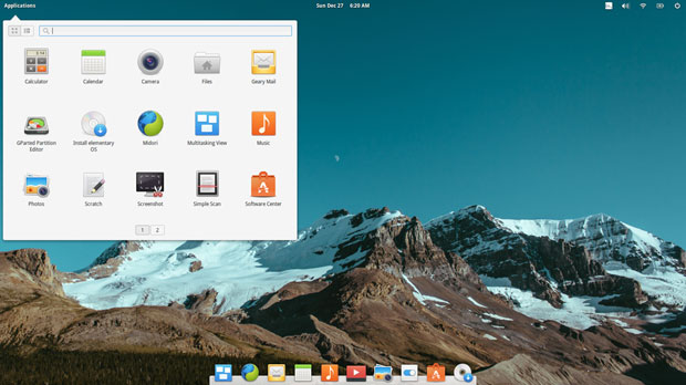
Elementary OS has nothing that resembles a Windows look and feel for newcomers to Linux. That is fine. The new distro is definitely easy to use, but similar to running the Android OS on a desktop, the lack of more in-depth features in Freya makes it frustrating to use for multitasking.
The main problem I find with it is that the simplicity gets in the way of my workflow. Users who do more than open a Web browser to surf the Internet or use a word processor to handle correspondence will find Freya too limiting.
What It Is
Elementary OS has a homegrown desktop interface. The design is very deliberate and extremely functional — to a point.
It’s a hybrid, inspired by Apple’s OS X but based on Debian Ubuntu. The default desktop is Pantheon. It’s written using Vala and the GTK3 toolkit.
The Pantheon desktop has a unique, simple, clean design. It has a striking similarity to the GNOME 3 Shell and OS X. Its Ubuntu underpinnings are anchored under the hood.
Elementary OS is not a clone of the OS X desktop, nor does it mimic a purely GNOME 3 environment. It looks a little like both of them, though.
For example, a configurable Mac-like app dock sits at the bottom of the screen. A transparent nonfunctional panel bar strides across the top of the screen to hold a few essential system notifications. Side panels jut onto the screen to show thumbnail views of virtual desktops.
Freya Close Up
Freya’s design excludes a traditional Linux menu in favor of an Activities label in the upper left corner that drops down a modified Slingshot-style display of application icons. The notification icons on the right end of this top panel bar include the Language emblem, Internet connection status, Bluetooth and battery status markers, as well as the Power Off icon to access the shutdown menu. The date and time are visible in the center of the panel space.
A Mac-like configurable docking bar sits in the bottom center of the screen. The bar, however, has fewer configurable options and display traits than other dock bar add-ons provide.
The developers created applications built specifically for Elementary OS’s custom-made desktop environment. It has photo, music and video applications preinstalled, along with the Midori Web browser and an integrated calendar with support for repeatable events and geolocating events.
Elementary OS does not preinstall other software management systems such as the Synaptic Package Manager and the gDebi Installer. However, both are available from the Software Center, which highly resembles what you see in Ubuntu.
Workspace Washout
For me, one of the most critical functionality points in a Linux distro is how it handles virtual desktops. Distros that let me place a Workplace Switcher app on the panel for near-instant point-and-click channel changing always win high praise from me. Even better is the ability to map keyboard shortcuts to make moving among work screens a two-fingered affair.
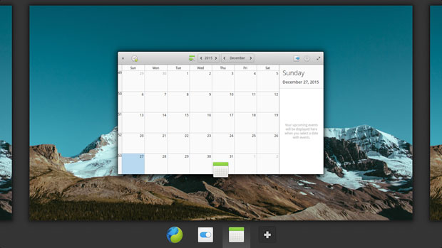
Freya does not do this. The Elementary OS distro uses a modified GNOME 3-like approach. In this distro, you access virtual workplaces through enabled hot spots or by pressing the Multitasking View icon on the far left of the dock bar. Then you press the plus icon to add a virtual desktop or click a postage-stamp-sized view of the screen you want.
Other options let you push the mouse pointer into a hot corner to activate the Multitasking View, or you can move your fingers across the touch pad or scroll laterally with the mouse.
Simpler Not Always Better
To change desktops, you must click the Multitasking View icon to see the partial edge of the other desktop along the edge of the screen. You cannot move an open window from one desktop to another very easily.
Another disappointment is the overly simplified file manager functionality. It lacks dual-pane view and the ability to open multiple panels to drag and drop files. It does let you open a new view in another tab, but you can only see one tab at a time. You must use a copy file/paste file process to move or change a file’s location.
The Multitasking View is a reduced-to-scale image of the desktop. There is no Expo view. Also among the missing features is right-clicking for a context menu. This is too rudimentary.
Low-Impact Release
Elementary OS Freya 0.3.2 is a minor release. It focuses on solving some issues with UEFI and Secure Boot. Those functions on newer hardware work better thanks to a completely rewritten .iso build system.
Other improvements include better localization support for languages and fixed language packs for 22 additional, prominent languages.
A few new features are present, but they do little to improve overall productivity. For example, the applications menu shows settings separately from applications in search results. Results also include matches for actions from Quick lists.
Bottom Line
The user interface presents a simplified approach to launching applications. Newcomers to Linux might like this concept, as might users who stepped too quickly into an advanced desktop such as KDE or Cinnamon.
More seasoned Linux users are likely to find the Pantheon desktop in Freya too confining and frustratingly simple. The user settings offer few choices for the bland desktop environment.
Want to Suggest a Review?
Is there a Linux software application or distro you’d like to suggest for review? Something you love or would like to get to know?
Pleaseemail your ideas to me, and I’ll consider them for a future Linux Picks and Pans column.
Use the Talkback feature below to add your comments!







I disagree with the "complement" that dumbing it down is a good thing as some of the above users have said. Their dumbing down is often regression not true simplicity.
EG. In Luna, the Multitasking Overview gave window previews which allowed you to have the same app open on diff desktops and easily – SIMPLY be able to multitask. Since 0.3 The devs have used icons which is near useless and takes eOS’s multitasking ability from being the best to the worst. Windows 10 is even a bit better and can drag windows properly…Regression.
Additionally lets look at the silly network indicator in 0.4. It shows too much technical info yet not the ones it should? Like what? Simply it shows the data transferred but not the connection speed / link. Odd and annoying. Regresssion – NOT simplicity.
Luna (0.2) had GREAT multi monitor support. Since 0.2 It’s been the worst distro despite the "tweak tool".
No, sadly elementary went from making hard things easier to making easy things hard…it is truly a dumbed down OS under the guise of simplicity. Not to mention the devs not being very pro suggestions.
Hi there.
In addition to the correction for switching desktops (already mentioned) I’d like to point out a correction on the file browser.
You can open multiple windows by either right clicking on the dock icon and selecting New Window, Pressing CTRL+N when browsing files or right clicking on any folder or item along the left side and selecting "Open in New Window".
You can even drag the individual windows to the edges of the screen and they will snap there (ala Windows) and drag and drop between them until your hearts content.
Seems as though two of the issues that were most problematic for you are not actually issues, you may want to give it another look. 🙂
Thanks for your comment. Your tutorial on using the file manager highlights the point I made in my review. The file manager does not have a dual pane function. It does not have any navigational commands to copy/move a file to another location within that single file manager window. It does not let you see more than one location view at a time. Of course, a user can open a second file manager by the methods you noted. But why should you have to use a workaround?
The purpose of the review is not intended as a detailed user guide for every aspect of the software. The items you focus on about my critical comments for this distro are not problematic for me. They are functional anomalies when compared to expected behavior. The review notes the good and the bad. I am very familiar with the product so I do not need to give it another look. 🙂
Thanks for your reply.
Don’t mean to offend, my comments were related to this statement – ‘ It does let you open a new view in another tab, but you can only see one tab at a time. You must use a copy file/paste file process to move or change a file’s location.’
This give the impression that the only way to move files to, and from, locations is with the copy and paste.
My comment was simply pointing out an alternative way to do this and that Copy and Paste are not required.
I realize the article isn’t a few review and just your opinion of the distribution, but if readers are unfamiliar with Elementary and are reading your article, it would be easy for them to get the wrong impression, hence my comments to help rectify that.
I really do appreciate your impression of the distribution though, not in any way trying to discount your opinion.
Agree with this post completely.
I’ve used AmigaOS, BeOS, MacOS, every version of Windows since 95 and Elementary. I’ve even used Corel’s Linux distro back in the day.
Elementary attempts to make Linux, MacOS friendly. I appreciate that. It wouldn’t be on my hard drive otherwise. I’d just have a Windows 10 box for gaming and image editing.
Right now, Elementary is where i do all of that except play Rocket League.
Dumbed down is how I want my computing experience.
Dumbed down? The cleanliness and the simplicity of ElementaryOS has taken my creativity to new levels. I do not need glossy buttons, transparency, nor do I need a slew of menus that pop up providing me every option with which to do the basic function that I intended to do in the first place. I want to work, and I want to get to the point. Being "dumbed down" is like handing a child a blue ice cream cone and asking him if he wants blueberry, blue raspberry, blue arctic ice, or blue iceberg lemonade. The child- simply sees the blue- and wants what he wants. As adults- reaching the point to maintain that simplicity is not dumbing down, but reaching a higher goal of simplicity.
I have used and tried all flavors of Windows, Ubuntu, Mint, Debian, Mandriva, Puppy, Mac OS9, Mac OSX- nearly everything except for beOS. It is with pride and joy I have settled down with MacOS as my desktop favorite. I tend not to dwell and spend so much time tweaking and experimenting with every endless menu that will pop along the way with every other operating system. As a matter of fact, when I did buy a new Mac four years ago- I thought I was dumb. I couldn’t find those hidden windows and settings- I did not know what to do- but after the realization that it was so simple and straightforward that it DID NOT NEED all of the extra options it was a refreshing change. I was finally able to go on again by simply pressing one button. And guess what?
It worked! It didn’t ever crash. I never turned the computer off. I never had to reboot. My life was no longer involved with maintaining the computer I worked for, the computer worked for me. If creating simplicity, coherence, and a tinker-free desktop environment is dumbing down, then you need to look again.
ElementaryOS is the ONLY Linux distro that I would even consider- and if you called that ‘dumbed down’ then take your flashy lights and bells and whistles and go get a headache somewhere else.
The description of how Freya handles workspaces is inaccurate:
"Even better is the ability to map keyboard shortcuts to make moving among work screens a two-fingered affair.
Freya does not do this."
In fact, you can move between workspaces using keyboard shortcut. The default one uses "Super" (aka Windows) key plus arrows to move right/left, but you can set your own shortcut.
The settings for this are exactly where you would expect it to be: System settings -> Keyboard -> Keyboard shortcuts -> Workspaces
Please correct this in the article.
Thanks for the heads up on this feature. On my test installation that setting option you indicated appeared grayed out so I could not see possible options. I reinstalled it and found that it remained disabled. I then installed the OS to another computer and found that it did work properly. So yes, the keyboard mapping did function fiunally. Maybe this is hardware dependent?
But my comment about not having a right-click option to move an open application window to another workspace is still accurate. The GNOME 3 architecture only allows a window navigation by clicking the workspace switcher on the dock to open the side window view and then dragging the displayed icon to the side panel. I prefer a more direct approach.
Perhaps there is a setting I missed. But so far, no other approach is evident to me.
Well I guess it goes beyond what Chrome OS is, but not by much. I agree that Linux in general is overly complicated but that is not what doomed it on the desktop. Although Chromebook’s appear to have staying power, they don’t appear to truly satisfy. Maybe Freya dumb’s down Linux just enough but not too much? I still don’t see much hope for Linux on the desktop in any form. Being a Apple OS X fan I do agree, their are times I think OS X is trying to hard and its getting bloated.
Elementary os luna is my favourite distro even today. The shift to gtk 3 in freya did more damage to my workflow rather than good. the most direct impact was that i lost all the titlebar actions and had to retrain my muscle memory(which failed). But it is not elementary that is entirely at fault. gtk3 should allow greater customization.
The previous version of ElementaryOS allowed you to control-arrow key through virtual desktops. I found this to be good enough for my (advanced linux user) needs. The design of this desktop is the best that I’ve seen so far in terms of usability across the spectrum of desktop users. I agree that the file manager needs to be better; but again, the previous version did provide panes — have they released one with less functionality than the one they had before?
I agree with you: Elementary OS does simplify Linux, but unlike you, I think that’s a good thing. There are plenty of distributions which claim to be easy-to-use. Almost all of them are targeted toward day-to-day Linux users like myself and that’s OK. Elementary OS just isn’t one of them.
Just as there are distributions (Arch, Gentoo) geared toward tinkerers, it’s a great thing that eOS truly makes things simple — oversimplified for you and me, but not for everybody. My current employer is a retail PC service shop in rural Ohio, and 75%-90% of our residential client base thinks they don’t know anything about computers. I have literally heard some of them come into the shop and call themselves "computer stupid." Were it not for the walled-garden issues, I would quickly recommend an iPhone for these people. Elementary OS is *perfect* for this crowd.
You and I might not agree with all of their design decisions, either, but their choices are well-reasoned and the attention to detail and UX is on par with Apple, something Linux culture needs a LOT more of. Having seen the differences between Luna and Freya firsthand, I’m sure we’ll see future development add features and tweaks that will make it more palatable for advanced users without sacrificing UX for basic ones.