![]()

Innovation time on the Linux desktop is right around the corner. GNOME.org is set to release the much-awaited GNOME 3 desktop sometime next month.
I am always looking to play with new Linux stuff. So I put the GNOME 3 beta release to work on my test rig a few weeks ago. The GNOME 3 Beta version 2.91.90 worked so well that I installed it on all of my computers so I can work with it no matter where I am or what system I use.
Some Linux distros already have the beta version available through the package manager repository. So if you are interested in checking out the GNOME 3 shell, check there first. Otherwise, you can download it here.
While I was generally pleased with my test drives of GNOME 3, the more I use it the more I realize that it will definitely create some ill will. Pretty much everything you know in GNOME 2 is different in GNOME 3. Despite the obvious improvements in the new desktop shell, GNOME 3 still needs too many mouse clicks to move around open applications and stored files. That is especially true when I move among the four virtual workspaces with multiple files open in each one.
What Makes Pretty?
GNOME 3 still lacks its own applications dock. And the GNOME panel that lets you pin icons to it for quick launch is gone. So I use Avant Window Navigator for my comfort zone. I discovered early on that AWN is still going to be a vital part of my desktop navigation after the official upgrade to GNOME 3. See my review of AWN here.
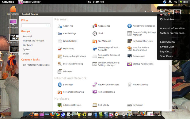
Even worse, the change to GNOME 3 disables Compiz, so all of the cool special effects — mostly desktop eye candy but still some nifty features — are left behind permanently, according to GNOME3.org.
The new GNOME shell uses the Mutter window manager to provide its own style of eye-popping animation effects. Compiz is a compositing manager that can also be a window manager. It improves user interaction by adding fancy effects to the desktop windows. In layman’s terms, Mutter and Compiz are like oil and water. They do not mix.
I used plain old Ubuntu for a few years without the Compiz effects enabled. Now I am accustomed to the rotating cube and related visual playground as I move from app to app in my work sessions. I do not relish Linux without it.
Installing It
Installing GNOME 3 is much more automated now that it has reached repositories. If your distro does not yet carry it, you can do the job yourself with only a little bit of tinkering. Besides, entering commands in a terminal window is darn good for your Linux soul!
Here is how I handled the GNOME 3 installation in Ubuntu 10.10. If your distro has Debian roots, the process should be fairly similar. Check your distro’s help forum for refined instructions.
Open a terminal window (Applications/ Accessories/Terminal) and enter these commands:
sudo add-apt-repository ppa:ricotz/testing
Wait for completion.
sudo apt-get update
Wait for completion.
sudo apt-get install gnome-shell
Running It
If all went well, you are now ready to take GNOME 3 for a test spin. I had solid success on my two desktop computers, two laptops and netbook. Each one runs a different AMD and Intel processor with varying memory configurations. The GNOME 3 shell is designed to run on a variety of computers manufactured in the last four or five years, according to GNOME.org.
Until the official final version rolls out, you have to manually switch shells. This is a nice testing feature since no permanent configuration changes take place and none of the default settings is gone when you reboot. To get started, press the ALT + F2 keyboard combination and enter this command:
gnome-shell –replace
Be sure to leave a space before the double hyphen. Then click the RUN button at the bottom of the Run Application window.
After a few seconds, the screen will probably flutter, and the new shell will appear. If nothing looks different yet, move the mouse pointer to the upper left corner of the screen. Now enjoy the view.
To exit the Gnome 3 Shell and return to a normal Gnome 2 desktop, press the ALT + F2 combination and enter:
debugexit
and press the enter key.
First Impressions
I’m not convinced that the new user interface for the shell is more efficient than the existing one. But the look and feel is definitely much different.
The coolest improvement is how the developers combined a file manager’s view with an integrated choice of all work spaces or a single desktop by clicking a button. For example, you open the file manager panel along the left edge of the screen by putting the mouse pointer in the upper left corner of the screen.
Start entering letters into the search window on top of the panel to see a list of icons for applications that start or contain those letters. Click on the icon to launch the app. The rest of the file manager’s contents disappear until you click the X box to remove the search results.
The grid display that pairs with the File Manager panel is nice to see but does not do much. You can enlarge a thumbnail with the mouse wheel or close an app window with a mouse click. But you can’t do anything else with the display other than drag thumbnails to other work spaces.
No Old Bar Flies
Launching a program this way closes the File Manager panel and gives you full-screen access to open program windows. The traditional panel bar across the top and/or bottom of the screen is gone in GNOME 3. Instead, an Activities bar is visible to display the name of the prominent or active app window.
This Activities bar displays the day and time in analog fashion in the center. At the far right are notification icons similar in function to the present GNOME 2 shell. You see the Internet connection marker and the user’s name that opens other menu options when you click on it.
For example, there you can click your IM status to Available, Busy or Invisible. You also can select Lock Screen, Switch a User, Log Out and Shut Down. This same functionality exists now in the GNOME 2 panel.
One big change in this interface is how you get to System settings. The drop-down menu has Account Information and System Preferences. Click on either one to open the corresponding window of account and system preferences. Gone from the new interface is drop-down access for Application categories and Places.
Less Functional Switching
With the File Manager panel displayed, you can see the open windows one work space at a time or all at once in a grid display. Clicking on a thumbnail window jumps that app to full-screen and hides the File Manager panel. But gone completely is the ability to move among open apps with the Alt + Tab keyboard combination.
To switch applications, you must return to the File Manager panel and click the app thumbnail. This anomaly was not a glitch caused by one computer’s inadequate configuration; it was present on all of my computers.
In work space view you can drag an app thumbnail to another workspace. In full screen view you can right click on the top edge of the app window to send it to another work space. But you cannot jump from one app to another one very conveniently.
Panel Play
The top portion of the panel holds your favorite applications. Click on the navigational arrow next to the Applications label to open a menu listing of installed applications. Right-click on an app icon to send it to the favorites display for quick launching.
The center of the File Manager panel lists Places and Devices. Click each item to have it appear as a thumbnail display. Click the thumbnail to open it full screen. Click the upper left corner to change back to File Manager panel display. See what I mean about all the clicking?
The bottom section of the File Manager panel shows a list of recently opened files. Click the navigational arrow to roll open the same list. I have not figured out why there are two types of display lists for the same function.
You still perform file management functions in the Nautilus windows. F3 still works to open a dual panel manager window.
Bottom Line
All current GNOME applications work just fine in GNOME 3. In fact, I did not have any trouble running KDE-based apps such as Konqueror, KOrganizaer and KSnapshot in GNOME 3.
The new interface wears thin after its novelty wears off. I was left humming the depressing song lyrics, “Is That All There Is?” after a few work sessions with GNOME 3.
If you are addicted to Compiz graphic effects, what you get with Mutter leaves much to be desired. If you are a sucker for a pretty face, you might fall for the new GNOME.


This was definitely a good review, and I think you are spot on for how gnome 3 is -right now-.
However, I would like to say that a lot of these issues will likely get worked out in the future (probably the next couple point releases?). For one thing, if they don’t add efficient keyboard shortcuts for everything there will be a mutiny.
I would also assume that mutter will eventually be just as pretty/functional as compiz, or I hope so anyways.
Like I said, good job on the review!
Well that sure needs a little work. Your "debugexit" didn’t work. Think it had some conflicts with Ultimate-Edition customizations. But it did work. Don’t think I’ll leave compiz and GTK. I can imagine the kids gettin on that would be noisy. I run and test all distros (I want to) and recommend to folks. Don’t wanna drop this on folks yet. Excellent post though. Someone I can understand. (clears throat).