![]()
Cylon is a classic Linux distro preconfigured with lots of tweaks — kind of a Unity-less Ubuntu with bling.Cylon runs the classic GNOME 3 desktop on almost any hardware configuration made since 2007, but it is more suited to seasoned Linux users. Newcomers to Linux may not make an easy transition.
Still, Cylon Linux is highly usable out of the box. With its installed software, there’s little need for supplemental installations. The user experience, however, might be less than appealing for those who are not at home with the GNOME 3 desktop.
I was impressed with Cylon’s speed and dazzling animations — but once the eye candy novelty wore off, I went to the Compiz setting panel to tone down the fireworks.
The classic GNOME 3 desktop is not for everyone. While Cylon’s developers did a clever job of tweaking the performance, they failed to make it easy to change default settings for accessing virtual desktops.
Cylon also suffers from a common problem with GNOME 3 desktop environments: It has too many separate settings panels for Administration, System Compiz and Preferences.
Family Ties
Cylon Linux was last updated December 6th, 2012. Due to its lineage from Ubuntu, this version is supported with system updates through 2017. Its current version is 12.04.1 and is based on a kindred connection to Ubuntu 12.04 LTS. Its partial rolling update approach keeps pace with the Ubuntu system updates.
Cylon is a relative newcomer and has a much different look and feel despite its obvious reliance on direct Ubuntu branding. Cylon was founded in November 2012.
Under Cylon’s Hood
Cylon Linux relies heavily on its Ubuntu underpinnings, but its closeness to Ubuntu is not readily apparent when you start using it.
This distro has a unique appearance. It looks and works nothing like the myriad of other Ubuntu derivatives.
Of course, the Software Center and the Update Manager carry the Ubuntu names and are the same repositories. Even the System Settings panel is strikingly similar.
Look and Feel
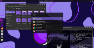
At first blush, Cylon’s desktop appearance is like numerous other carbon-copy Linux distributions — but the similarity ends once you get beyond the GNOME 3 panel at the top and the Docky bar at the bottom of the screen.
The big difference appears as a flash in the pan once you start clicking around the menu. It is a skimpy menu, by the way. It consists of a single column organized by category. The contents of each category slide out from the right as you hover over each label.
Expect to spend considerable time scrolling lists of submenus. The main menu lacks any search window. Also, it lacks any favorites panel.
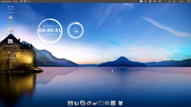
That may be why developers preinstalled the Synapse search and launch tool. The launcher is hardwired to the top panel. You also can access this app by setting a keyboard combination.
Flash Bang
Click on a menu item or touch any category with the mouse pointer, and the flashiness begins. The default visual effect is for a flash of flames that blaze for a fraction of a second and then fade away.
Programs open with their windows upside down and then spinning right side up. By default, the window controls — maximize, minimize and X — are in the left corner, just like Ubuntu.
Users familiar with Compiz effects will appreciate how Cylon has the CompizConfig Settings Manager installed and activated. Seasoned Linux users also will be able to change the settings as desired. However, strangers to Linux easily could be intimidated by all of the options.
It is perhaps the combination of the Docky Bar and the brash Compiz effects that set Cylon ahead of other Ubuntu Linux offspring. The level of Compiz settings resembles much of the inherent interface chaos some Linux users experience with the KDE desktop.
Panel Woes
The classic GNOME panel leaves a lot to be desired. Open programs are highlighted on the Docky bar. A few launchers for system tools are anchored to the top panel. But GNOME 3 does not give users any configuration access to this locked-down panel.
Other than displaying a few expected notification icons along with the application and places menus, the panel lets users do little with the wasted space.
Not having the upper panel serve as an anchoring point for personalized applets and pinned favorite programs is a sore point for many Linux users disgruntled with the GNOME 3 interface. Cylon’s use of GNOME 3 does little to assuage that design dysfunction.
Cubed Delight
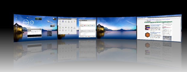
The spinning cube is without a doubt one of the most attractive visual effects associated with using virtual workspaces in Linux. The CompizConfig settings gives Cylon users a huge variety of options for tweaking how the cube performs. Basic cube functionality is preconfigured in this distro.
Hold the left CNTRL + ALT keys down while you press the left or right arrows. This changes the screen view to the spinning cube.
Hold the arrow key down to watch a perpetual spinning cube. Or press the arrow key more deliberately to move among the virtual workspaces.
Missing in Action
As mentioned earlier, one of my main disappointments with Cylon’s design is the way it handles access to virtual workspaces. Most GNOME 3 desktops have a hidden thumbnail view that slides in from screen right when touched by the mouse pointer to show activated virtual workspaces. Clicking on a thumbnail gives you full-screen access to that virtual location.
If that feature exists in Cylon Linux, it is a well-kept secret. The feature is not activated by default. I could not find any system setting for it.
Also missing is any setting for the number of virtual workspaces you want to use. I am normally very good at finding such hidden triggers. The fact that I can not find it strongly suggests to me that the feature does not exist rather than is just well hidden.
No Way Out
Either way, this is a major design flaw in Cylon’s implementation of the GNOME 3 interface. I was able to send a program window to any of four work spaces by right-clicking on the top border of the application window. This feature exists in most Linux desktop flavors.
However, the lack of the standard access to those virtual spaces for me is a disconnect and a deal breaker. The design fails on several levels.
First, it is awkward to have to find the program icon resting somewhere on the Docky bar and then click on it to swing onto that virtual workspace. Second, it is distracting to have to move fingers off the typing rows to press the three-key combination requiring two hands to spin the cube to the appropriate workspace. Three is the lack of configurable shortcut keys to move among virtual workspaces.
The Ubuntu distro — and its various alternative desktops — have these features. So do other Ubuntu-based distros such as Linux Mint.
Yes, Good Exists
Those design flaws aside, Cylon Linux offers numerous features to make it worthy of consideration. Perhaps one of the most impressive features is the well-stocked installed software.
Most menu categories are stuffed with a dozen or more applications. In many cases, the list includes four or five options for the same types of programs. In nearly all cases, users will have little or no need to go to the Software manager to find more titles.
What Cylon lacks in panel applets it makes up for with its ample inventory of Screenlets. Finding and installing what you want is fast and easy.
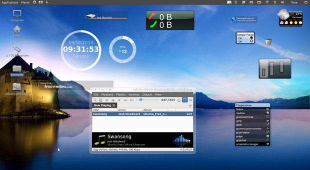
YPPA is a handy application that makes it very easy to add and manage PPAs, or Personal Package Archives. This tool automates the process and requires just clicking and selecting options.
Bottom Line
If you fancy the solid Ubuntu infrastructure but want something a lot different in user experience, give Cylon Linux a try. The visual effects are impressive and the system is preconfigured to work as installed.
However, do not expect Cylon Linux to be a Windows XP substitute. It is intended for use by Linux users who have a liking for more traditional GNOME 3 functionality.
Want to Suggest a Review?
Is there a Linux software application or distro you’d like to suggest for review? Something you love or would like to get to know?
Please email your ideas to me, and I’ll consider them for a future Linux Picks and Pans column.
And use the Talkback feature below to add your comments!


