![]()
Ubuntu 17.10, otherwise known as “Artful Aardvark,” is a paradigm shift for Canonical. The company is set to release the official version of the much anticipated Ubuntu 17.10 desktop, server and cloud distro on Oct. 19 — it released the final beta version late last month.
Ubuntu 17.10 comes with a new default desktop to replace the retired Unity interface. It’s likely that GNOME 3 is too commonplace to serve as the flagship desktop for Ubuntu, as it probably would not keep or attract users bemoaning the loss of Unity.
Other desktop flavors also are set for release, including Canonical’s tweaked versions of Ubuntu MATE, Ubuntu Studio and Ubuntu Budgie.
The Artful Aardvark edition includes Kubuntu, Xubuntu and the Chinese government-compliant Ubuntu Kylin distro.
The entire beta release line shares the core Ubuntu base and uses Linux kernel 4.13. Ubuntu 17.10 comes packed with a collection of bug fixes, security updates and related tweaks.
The initial release of Ubuntu Linux enticed me into abandoning Windows in favor of the Linux computing platform years ago. I never looked back. However, I did shift from Ubuntu’s Unity desktop, preferring less drastic interface changes in other Ubuntu-based Linux distros along the way.
With the release of the final beta of Ubuntu 17.10, I decided to check out the suitability of two of the newer Canonical desktop offerings. GNOME 3 today is a far sight more comfortable to use as a daily workhorse environment. Budgie is a less demanding and lighter desktop environment that also lets me get through my daily workload with few frustrations and distractions.
Knowing GNOME
I have dabbled with the various GNOME 3 releases that left the very likeable GNOME 2 behind. The latest iteration of GNOME 3 in Ubuntu 17.10 is a lot less jarring than I anticipated. Canonical baked in its own unique branding elements. Once you account for the absence of the Unity heads-up display (HUD), you find more similarities between Unity and GNOME and more to like
What’s most strikingly obvious is how much the two desktops look like each other. GNOME uses a vertical docking bar along the left edge of the screen. It places a traditional panel across the top edge of the screen.
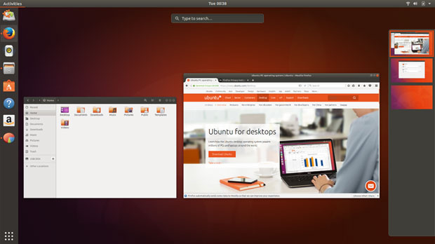
The left panel doubles as a favorites bar. It shows open applications with a dot to the left of the icon on the dock. The top panel remains mostly a display holder for system notifications.
The full-screen software menu display is accessed by clicking on the menu button at the base of the vertical panel. From there you can click a tab to display frequently used applications or all applications.
Using the Features
I still have a mental block regarding the slide-out thumbnail display for virtual workspaces in GNOME 3. Ubuntu’s integration does not lessen my stubbornness in that regard.
If you fancy the more traditional workplace switcher applet that resides on the panel bar in other desktop environments, like Xfce and Cinnamon, GNOME 3’s sliding thumbnail display from the right edge of the screen will take some getting used to. You access that display by pressing the Windows button on the physical keyboard or clicking the Activities button in the top left corner of the screen.
Ubuntu users lamenting the loss of the Unity desktop can take some solace in a GNOME search feature that is somewhat like the Unity search display. In Activities, you can start typing a file name without first clicking the cursor in the search window at the top center of the screen. As you type, applications and files that match those letters appear on the screen.
You can launch the desired application by clicking it, arrowing down and pressing the enter key, or touching it (if you have a touchscreen).
The Budgie Alternative
I have used several other Linux distros sporting the Budgie desktop and found most of them to be overly simplified. Ubuntu Budgie’s user interface is slightly different. Its integration into the Ubuntu design is smoother and more sophisticated than I have experienced elsewhere.
The Budgie OS is an intuitive and attractive desktop environment that uses traditional metaphors, according to Canonical.
If you have used Windows or OS X, Budgie should feel very familiar, the company suggests.
However, that description might be a bit misleading, as the interface is nothing like either Windows or OS X.
That said, the Budgie desktop is easy to use. However, it also is very different from the user experience that was associated with Ubuntu Unity.
Budgie is classy and user-friendly. It does not sacrifice performance for its reliance on a simpler design. It has a plain and clean style. The Solus community originally developed Budgie from scratch, and tightly integrated the desktop user interface with the GNOME stack. In some ways, I find Budgie to be GNOME 3 light.
Budgie’s Look and Feel
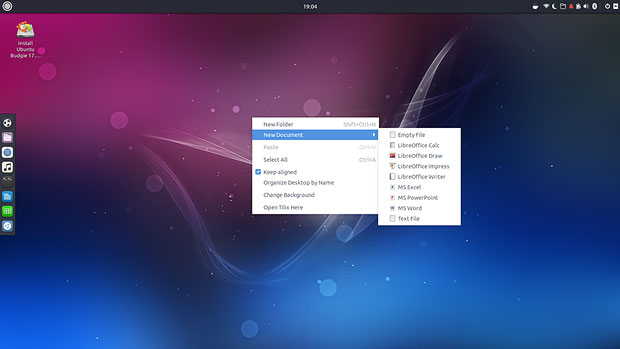
The desktop sports a top panel for menu access, notifications and such. A dock or plank resides along the left edge of the screen.
The heart of adjusting the Budgie desktop is the applet Raven. It is the desktop’s notification and customization center. Combined with the system settings panel, Raven is the key to controlling the user experience through easy customizations.
To access Raven, use the super key + N key combination. You also can click on the Raven icon on the panel bar. The Raven display slides out as a vertical column from the right screen edge.
Within the Raven applet, click the Applets tab to access the controls for calendar, speaker and microphone. Click the Notifications tab to see unread system notifications. At the bottom of the notifications panel is the gear that opens the Budgie settings panel.
Interface Interaction
Click the setting gear wheel in the Raven panel to open the Budgie settings panel. Clicking it opens the Budgie Desktop Settings. There you can adjust the appearance and settings of the screen, panel applets and more.
Right-clicking on the desktop opens a limited menu with the ability to create a new folder, change background, open a terminal window and organize icons.
The application menu is scaled to for simplicity. Its two-column design has no cascading views. The left column lists the application categories. The right column lists the individual apps in that category.
A search window at the top of the two columns makes it easy to locate any installed program quickly. A search field sits atop the applications menu. Just start typing a program title or name of a setting or file to see a list of possible options that match to instantly launch it.
You’ll also find virtual simplicity using the workspaces display. In order to enable virtual desktops, you first must add the workplace switcher applet to the top panel.
Navigating is as simple as clicking the workspace square in the switcher applet. You can map keyboard shortcuts to navigate without using the mouse by going to the keyboard section of the settings panel in the main menu.
Bottom Line
If you are looking for a change-of-pace desktop that has a modern flare and very tiny learning curve, Ubuntu’s integration of both GNOME 3 and Budgie easily can fit your needs. If you want to keep using the Ubuntu family desktop line, take the other Ubuntu flavors for a spin.
Or, consider checking out the GNOME and Budgie flavors as an alternative to your current Linux distro. Canonical is a solid developer that has pioneered many innovations.
Want to Suggest a Review?
Is there a Linux software application or distro you’d like to suggest for review? Something you love or would like to get to know?
Please email your ideas to me, and I’ll consider them for a future Linux Picks and Pans column.
And use the Reader Comments feature below to provide your input!


