
![]()
The latest release earlier this month of the K Desktop Environment, or KDE, is a solid upgrade that could very well win back the hearts and fingers of Linux users who wandered off to other, less powerful desktop shells. I am particularly impressed with its smooth integration into the dedicated KDE distribution in Linux Mint 13.
I lost interest in KDE after it left version 2.x behind. It was becoming clunkier to use and too much of a hassle to handle. With Gnome 3.x and Ubuntu’s Unity environments even less appealing, I bounced between the Cinnamon and XFCE desktop alternatives until trying the KDE 4.9 release. The switch to KDE has been well worth the effort.
The new KDE brings major updates to the Plasma Workspaces, KDE Applications and the KDE Platform itself. Along with many new features comes much better stability and performance.
For example, earlier versions of KDE on Ubuntu always posed wireless connection troubles on several of my laptops. This version, however, needed no fiddling to make a wireless connection.
KDE is the most powerful of desktop options for Linux users. Its heightened eye candy — Compiz still works so the option of using the cube and its extensive desktop effects — makes it a big step up from the other desktop choices.
How to Get It
The KDE Distro release for Linux Mint 13 is slick and fun to use. The Linux Mint developers push a preference for fresh installations of each dedicated desktop distro rather than a rolling upgrade. So switching from MATE, Cinnamon, XFCE or KDE is a bit more involved if you install specific applications that are not in the default setup.
As in most other Linux distros, you can install one or more of the available desktops and switch among them by logging out of one desktop and logging in again after selecting the desired desktop from the options menu on the log in screen. The only major disadvantage to this approach is having a more bloated collection of files needed by the different desktop environments.
So your first decision is how you will get it. Purists may prefer a direct download from KDE.org or the Synaptic Package Manager. Or you can get the Linux Mint 13 KDE distro here. A final option if you already run Linux Mint is to install KDE directly from the Mint Software Manager.
I found no difference between the Software Manager method and the complete Mint KDE distro other than the time involved. For example, I installed KDE from the Software Manager on a laptop. I did a fresh installation of the KDE distro on a desktop computer. Both approaches got me the same KDE version. That didn’t happen last week when I tested the Linux Mint 13 XFCE distro. I was up and running in under 40 minutes on the laptop versus a little over two hours with the desktop installation, including time to download the KDE distro ISO file and burn a Live DVD installation disk.
First Impressions
KDE builds in easy right-click access to specific desktop settings. The included gallery of background images is stunning. Also a nice touch in this setting array is the ability to select from several icon sets and desktop themes. Plus, you get one-click access to downloading more of both categories.
One of the best features is the on-demand run command box. This is not an alternative terminal window. You can configure this search tool window to open at the top of the screen or function as a free-floating image on the screen. You can also configure its style to be command- or task-oriented as well as select which plug-in filters to use for content searches.
This tool stays hidden unless you activate it by pressing the Alt-Fn 2 keys. You can search for individual files, programs and even perform basic math calculations and simple measure conversions without using a separate calculator app. In essence, this feature gives you similar functionality as the Ubuntu Heads Up Display (HUD).
Another impressive feature in KDE is the ability to create multiple folder views to keep favorite files and programs in a resizable and movable window you can hide or dock until needed. This is a great alternative to cluttering the desktop itself.
Workspace Wonderful
I am a huge fan of multiple virtual workspaces. So one of my primary concerns with any desktop environment is a seamless access and functionality to switching from one to the other virtual desktop as I manipulate different work projects and computing tasks. KDE’s performance excels in this regard.
The virtual desktops flow fluidly without taking fingers off the keys. Keyboard shortcuts are very configurable for an effortless finger dance from typing to navigating and back again. A workspace pager on the panel augments workspace control with the mouse.
I tend to use four virtual locations. But KDE lets you have a dozen or more if you wish.
Edgy Actions
Screen edges and corners are also configurable for virtual workspace control. You can change that default hot spot to seven other screen edge positions or configure different virtual space viewing actions for different hotspots.
For example, the default hotspot in the upper left corner of the screen provides an all desktops view. But you can change that to a different style view or add other views at other hotspots.
The Alt-Tab keys combination lets you cycle through each running application in this view. Within the same virtual workspace screen the Alt-Tab switch moves through each running app there. Hover over the pager squares on the panel to see a thumbnail view of apps on each virtual desktop.
A related new feature is an activity button in the upper right corner that has a variety of functions depending on your present activity. You will need to read through some documentation to learn how to use it. But this activity feature supplements or expands how you now use virtual workspaces.
Activity Showcase
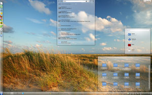
KDE includes yet another option in how you organize your desktop and view your various desktop screens. Click the Show Activity Manager icon on the panel or the Meta+Q keys to open a transparent bar across the bottom of the screen. You see four preset activity buttons: Photos Activity, Search and Launch, Desktop and Desktop icons. A fifth button lets you create new activities.
Here you can also add widgets to the view. Each button changes the screen display to show a collection of files or applications that you configure for the view.
The Desktop view gives you a KDE Plasma Screen background with a launcher displaying categories across the center of the screen. Click on a category to see an new breakout of all the content in that category. Return to your default desktop display by pressing the key shortcut or the panel icon again.
Fiddler’s Fancy
You can fiddle with single or multiple panels, widgets on the desktop and widgets on the panel. The System Settings and Desktop Settings menus are more extensive than I have seen in any other desktop environment. Unless you are already familiar with KDE, you can literally spend several hours trying different combinations of settings. Every aspect of the desktop is configurable.
For example, you can select styles for the way windows are displayed as well as how they behave. Some of the settings menus go five or six levels deep. You also get a vast assortment of choices for what effects are displayed when windows close or minimize.
One of the best reasons for choosing this KDE version over running Cinnamon or MATE or XFCE desktop environments is the stunning desktop effects. Not only can you choose the desktop cube animation transitions which are missing in the latest GNOME version or in Ubuntu’s Unity and other more lightweight desktops. You can pick a cylindrical or spherical shape as well as slide or fading transitions for virtual desktop switching effects.
I absolutely love the setting that automatically snaps application windows into equal areas when they overlap on a desktop and automatically tile open windows every time you open a new app in the same virtual desktop screen. Close a window and KDE automatically adjusts the size and space of the remaining open windows.
Bottom Line
This latest KDE release makes up for all of the faults of earlier versions. As a result, heavy customizers will love KDE again. However, newcomers may find this version of KDE overwhelming once they venture beyond the default settings.
But if you are looking for a peppy and pretty Linux desktop environment that far exceeds the performance of other desktop choices, KDE is a sure winner!









KDE is not a acronym anymore and not just a desktop environment anymore. KDE now stands for the community that creates various free and opensource software, including Plasma workspaces (the closest to old concept of desktop environment, not for desktop anymore but also separate configurations for netbooks, tablets, smartphones). For more info on the rebranding see: http://dot.kde.org/2009/11/24/repositioning-kde-brand