![]()
KororaLinux has the potential to grow in popularity among users looking for a better, more user-friendly Linux distro that reaches beyond Fedora’s enterprise appeal.
Korora 19, released on July 2, is an interesting Linux OS based on Fedora, the community version of parent company Red Hat’s Enterprise Linux. Korora is packed with lots of additional packages, however, besides those provided by the Fedora community. For various design and community reasons, Fedora leaves out some popular user packages. Korora fills in those gaps by providing everything a user would want and more. That explains why Fedora’s typical 3 GB installation footprint is less than half the size of Korora’s 7 GB.
Korora’s default applications include staples such as Adobe Flash, Google Chrome, Google Earth, RPMFusion and VirtualBox. It mixes in other popular packages as well. For instance, SELinux is enabled by default. VLC is the default media player. Video editor Kdenlive comes preinstalled for the KDE version, while OpenShot is preinstalled for the GNOME version.
Korora’s use-it-out-of-the-box philosophy is further evident with Firefox installed as the default Web browser with an integrated theme for KDE. Firefox is configured with the Adblock Plus, DownThemAll, Flashblock and Xclear extensions included. Choqok is the microblogging client of choice for KDE; for GNOME, it’s Gwibber.
Changing Gears
The Korora distro is a small project that was started by founder and lead developer Chris Smart some eight years ago as “Kororaa.” Its name comes from the Maori word for “the little penguin.” Smart’s purpose was to quickly reproduce a Gentoo Linux installation on multiple desktop machines.
Smart discontinued that project in late 2007, only to reintroduce it nearly three years later as a Fedora Remix. With the release of version 18 on May 2, 2013, he changed the project’s name to Korora, minus the double letter “a.”
The release of version 18 not only brought about the name change and new website home, but also brought on Ian Firns as the first codeveloper. Do not confuse Korora’s home page — Kororaproject — with that of a commercial website for a Web design firm by the same name.
Korora Inside
The Korora distro comes in two flavors — GNOME and KDE — both available in 64-bit (x86_64) and 32-bit (i686) versions. Both are similarly focused and aimed at making Linux easier to use with a preconfigured system for end-user convenience.
This distro brings with it an advantage to using either of the two desktop environments. Developers have enabled GNOME extensions and desktop features. They also did a housecleaning of the KDE menus and tidied up other desktop functions.
Korora has built-in multimedia support plus easier access to third-party hardware drivers. It installs with popular repositories enabled. So you have little or no installing and configuring to do after installation completes. Both versions include the Jockey device manager to handle drivers such as Nvidia and wireless cards.
Running GNOME
GNOME 3.8 brings new applications such as clock and improvements to the desktop. These include privacy and sharing settings, ordered search and a frequent applications overview.
One of its neatest features is the ability to enable a classic mode to create a user experience similar to that of GNOME 2. This is built out of a collection of GNOME Shell extensions.
If you do not like GNOME 3, being able to switch into this classic mode makes up for Korora not having other desktop alternatives besides KDE.
User Experience 101
GNOME 3.8 and the Korora tweaking seem to have addressed some of the usability issues of earlier GNOME versions. In normal mode there is still no functional panel bar. Still, using the GNOME desktop in Korora seems more fluid than GNOME in other distros.
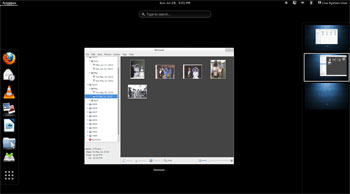
You still push the mouse pointer into the Activities hot spot in the upper left corner of the screen to see a scale view of applications you have opened and to see a thumbnail view of your virtual desktops. That also exposes the vertical bar on the left edge of the screen.
This vertical dock on the left edge of the screen holds icons for favorite programs you have pinned there. In this mode a search window is at the top of the screen. Type in an installed program’s name to launch it or switch to that application.
Look and Feel
The slide-out virtual desktop panel on the right edge of the screen in Activities mode is very responsive. With no traditional panel in GNOME 3, there is no desktop switcher applet to click to change desktops with one action. GNOME 3 does have a panel at the top of the screen to hold time, date, connection status and other system notifications, however.
You still must go to Activities view and then move the mouse to the right screen edge. Then you can click on the virtual desktop you want or drag the open apps running in one virtual desktop to another with ease. Similarly, switching apps from this panel seems less bothersome to me than it is in other distros running the GNOME desktop.
At the bottom of the left panel in Activity mode is a Show Applications button. Clicking it brings you to a screen showing all of the installed applications or the frequently used programs. You switch between these two options by clicking on the desired option at the bottom of that screen.
App Access
You also can find installed applications by typing terms in the search window at the top of the screen. Applications and files that match the search term appear in an icon list for clicking.
I much prefer to work from a menu listing rather than find applications by searching, but Korora packs an impressive array of applications without forcing the user to hunt for them in repositories.
Running KDE
Korora 19’s KDE Plasma Workspaces 4.10 is a modern, stable desktop environment. It includes new features for printing and screen-locking, better indexing of files and improved accessibility features.
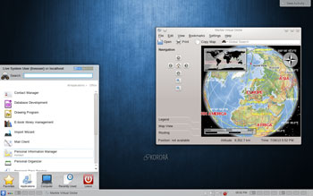
I was much more impressed with this KDE desktop version than the GNOME version. The KDE menu provided ready access to all of the features and software. Plus, the KDE desktop has a panel bar at the bottom of the screen.
For example, the Software Manager, Apper, was readily available on the Favorites panel in the KDE menu. The Software manager app was not so easy to find in the GNOME version. You use it to get, install and update software in Korora.
Handier Menuing
The System Settings icon to launch that menu was also plainly visible. In the GNOME version, you had to click on a drop-down menu tucked away on the right end of the panel bar at the top of the screen.
The Applications menu showed all of the expected software categories. Clicking on any one of them provided access to numerous prepackaged applications — no need to use the search feature to see what programs were available.
Still, the KDE menu launcher has a Search window at the top of the pop-up panel to provide quick access to any program or file without looking through menu categories. Even accessing the virtual desktops is a breeze in the KDE version.
The desktop switcher app fits handily on the lower panel bar, providing one-click access to each virtual desktop. Keyboard shortcuts are also available. Either method eliminates the vertical right panel approach enabled in the GNOME version.
Bottom Line
Korora is a seasoned Linux distro that shows a great deal of potential for continued popularity among both new and veteran Linux users.
It lacks lightweight desktop options such as Xfce and LXDE, but the latest GNOME 3 version, the optional GNOME 2 extensions and the newest KDE desktop provide a fresh, reliable choice. Korora is a solid alternative to Debian-based distros the likes of Ubuntu and Linux Mint.
Want to Suggest a Linux Application for Review?
Is there a Linux software application you’d like to suggest for review? Something you love or would like to get to know?
Please send your ideas to me, and I’ll consider them for a future Linux Picks and Pans column.
And use the Talkback feature below to add your comments!


