![]()
The Linux community and Linux users are at odds over the transition from GNOME 2 to GNOME 3 as the backbone desktop environment for the OS. Ubuntu’s developers muddied the situation with its newcomer Unity desktop alternative. Given the situation, Linux Mint may offer the best solution if you need time to adjust to the radical changes in the GNOME 3 desktop.
I was an avowed Ubuntu user until its developers created and pushed the Unity desktop shell as the default approach that avoided GNOME 3. I really tried to use Unity, even though I did not like it. I eventually side-stepped it and used the GNOME shell. That, too, was a frustrating endeavor.
I gradually moved each of my desktops and laptops to Linux Mint 11, which is based on Ubuntu but has its own distinguishing characteristics. For one, it retains the GNOME 2 desktop environment. Last week Linux Mint 12 RC was released. Mint 12, while still a derivative of Ubuntu, offers a more satisfying transition to GNOME 3.
Linux Mint 12 eases you into GNOME 3 as the desktop but retains an alternative desktop called “MATE.” In addition, Linux Mint 12 developers built in a few extensions that mimic the things users were complaining about in losing from GNOME 2.
For instance, Mint 12 developers designed a functioning panel that resembles the GNOME 2 panel. It works, unlike what the raw GNOME 3 gives you and what Ubuntu’s Unity does not. You also get more functional access to virtual desktops.
The release candidate version of Linux Mint 12 is continuously updated through the Software Update feature. Each revision adds more refinements. I get the impression that the last installment of Mint 12RC will roll into the official Mint 12 version when it is time for the upgrade. Mint 11 will be supported for an extended time. Thus, users of either version will have ample time to maintain their computing comfort zone.
But like it or not, GNOME 3 is the new direction for the Linux OS. So this week we take a close look at both Mint versions. Newcomers to the Linux OS will find Mint 11 a handy starting point. More savvy Linux users will appreciate the tweaking in Mint 12 that makes GNOME 3 more usable and palatable.
Getting There
I was pleasantly pleased with the installation process for both Linux Mint 11 (dubbed “Katya”) and 12 RC (code-named “Lisa”). Both involved downloading an ISO file and then burning a bootable CD or DVD from it. I was also surprised to discover that the Linux Mint 12 RC was a live version. That let me decide if I liked the GNOME 3 implementation without having to fully install it to the hard drive.
Depending on your existing computer configuration, the installation process gives you up to four options for both versions. My own gear has a variety of OS combinations and hardware. That led to different results. But more often than not, a straight installation worked more reliably. Data was left untouched, though apps were left on the drive that did not work until reinstalled.
For example, the installer detects what is present and offers several options. Install to the full hard drive is the surest option. But it wipes the hard drive and destroys all existing data. If you have Ubuntu installed, the Mint installer offers to replace it while saving your installed applications and data. A third option creates a partition to install Mint next to an existing OS and set up a dual boot menu. The fourth option lets you manually configure the partitioning process.
Downsize or Not
Another very useful option with both Mint 11 and Mint 12 RC versions is the choice of form factor. Linux Mint offers a full installation version that includes a complete set of codecs in the ISO file. This download only fits on a DVD.
A no-codecs version lets you comfortably squeeze the installation files onto a CD. Other than shortening both the download and install times, you do not miss a thing with the no-codecs version.
A window appears when you run Linux Mint giving you quick access to user documentation and other useful information. Here you also get the option to download and install the full set of codecs that were not present in the CD version.
Saving the Status Quo
Linux Mint 11 works extremely well as a replacement for the way Ubuntu USED to work for me. Not counting the look and feel design of the Mint desktop themes, I was instantly up to speed with using virtual workspaces, using the GNOME 2 panels as docks, and resizing application windows my way.
Alt/Tab switching worked as I wanted it to function. My Compiz graphic settings stayed in place and continued to let me enjoy the pyramid and other graphic effects that I have grown to love in GNOME 2.
The most noticeable reminder that I was using Mint 11 rather than a pre-Ubuntu 11.10 version is the Menu display. The menu closely resembles the classic Microsoft Windows box and column design. But being a derivative of Ubuntu, the Linux Mint 11 application base was very satisfying to see.
One of my favorite applications is the now discontinued Notecase Notes Manager. That still is available in Mint 11. Ubuntu’s commercial developer, Canonical, removed that package from its version 11.10 upgrade. Canonical also removed enough of the dependency libraries that manually installing it from other repositories failed to let Notecase Notes Manager run under GNOME 3.
Goin’ GNOME 3
After my unpleasant experience with GNOME 3 in Ubuntu, I quickly adjusted to the new GNOME in Linux Mint 12. Much of the credit for this newfound acceptance of GNOME 3 comes from the extensions the Linux Mint development team designed into the GUI (graphical user interface). This makes you wonder why the GNOME 3 developers did not offer a similar approach themselves. I find it much more workable than the Ubunu Unity shell replacement.
The MGSE or Mint GNOME Shell Extensions is a desktop layer on top of GNOME 3 that finesses GNOME 3 so you can use it in a traditional way. You can also disable some or all of its components to get a pure GNOME 3 experience. But why would you want to?
Its main features include the bottom panel, the application menu, the window list and visible system tray icons. Also, a task-centric desktop lets you switch between windows, not applications. MGSE also includes additional extensions such as a media player indicator and multiple enhancements to GNOME 3.
Slick Menu Too
Both versions of Linux Mint have unusual and different menus. The menu in Linux Mint 11 seems to be based on the Slab menu that Suse developed. But the Mint team added many new features. You can switch to the default GNOME menu instead.
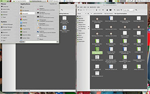
To open the menu in Mint 11, click on the “Menu” button in the left corner of the panel or press CTRL+SUPER_key near the left corner of the keyboard. On the top left corner of the menu is a section called “Places” containing five buttons. These buttons give you quick access to the most important places within your GNOME desktop. Two labels at the top of the menu box let you see all applications or those assigned to Favorites.
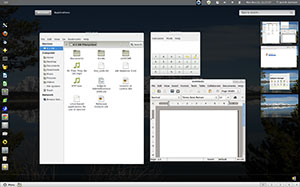
Linux Mint 12 comes with a redesigned menu. The left column of the menu display shows the same Favorites bar that displays in the left edge of the GNOME 3 screen. All other applications are listed in two columns in the menu box.
More GNOME 3
The goal this week is to highlight the latest two versions of Linux Mint as a more complete alternative to the pure GNOME 3 desktop environment and the Ubuntu 11.10 upgrade and the Unity desktop. That leaves little space to actually discuss the ongoing dismay with GNOME 3 itself.
Still, there are some similarities with GNOME 3 in Linux Mint 12 and the GNOME desktop option in Ubuntu. The common ground rests with how GNOME 3 works. The beauty of Linux Mint 12 is the use of extensions to give you traditional window switching and virtual workspace access.
For example, in both Linux Mint 12 and Ubuntu 11.10 you move the mouse pointer to the upper left corner of the screen to switch to the desktop view and access to the Windows and Applications buttons. In Linux Mint 12 you can also get there by pressing the Control + Super key. You move the mouse pointer to the right edge of the screen to expose the virtual workspaces thumbnail.
Click on the thumbnail window to move to applications docked there. Or drag applications from one thumbnail window to another. The applications tray in both distros are anchored on the left edge of the screen. Alas, Compiz no longer works in GNOME 3.
Bottom Line
The GNOME community forced the new design standards. Most major Linux distributions are now upgrading to GNOME 3. Most distro developers are implementing GNOME 3 as-is. Linux Mint offers two alternatives to how or when you make the switch.
Linux Mint 11 lets you maintain your current computing habits without learning new GNOME tricks for now. Linux Mint 12 gives you a transitional path into GNOME 3 without giving up the familiar usability of GNOME 2.












"Like it or not, GNOME 3 is the new direction for the Linux OS."
I almost stopped reading, right there. "Gnome" and "Linux" are not synonymous, not even close. I’m typing from a Sabayon7 desktop right now, test driving the new Gnome. And, I don’t like it.
My solution? I’m moving to Enlightenment.
I’ve never actually counted the desktops available to Linux users, but I’m sure there are at least a dozen. Anyone who attempts to link Linux to a specific desktop manager has missed the whole point of using Linux in the first place.
i like and use unity everyday, but mint12 will be another great alternative for my friends using gnome2 and clients in case they dont want to go with unity. also i personally didnt liked vanilla g-shell so this i will try.