
![]()
The Pinguy OS is a solid Linux distro with a focus on simple and straightforward usability for the non-geek desktop user.This approach may disappoint those who favor newer user interfaces, but if you consider yourself a normal computer user who does not like to tinker with settings and various desktop environment options, Pinguy OS could be a good choice.
Pinguy OS is based on Ubuntu’s 14.04 LTS release. It uses the Linux Mint infrastructure for package updates. Ubuntu’s Software Center and the Synaptic Package Manager serve as the systems for adding or removing software.
The Gnome desktop is the only user interface option. However, Pinguy OS’s developer, Antoni Norman, has tricked it out suitably with a Docky bar combination. The quick launch bar at the bottom of the screen and a hidden Places bar on the left edge make up for the loss of icon launchers from the desktop itself, thanks to Gnome.
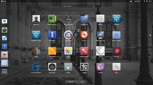
The Gnome 3 user interface is a bit clunky compared to some of the newer desktop interfaces populating Linux distros. Still, the tweaking done here makes using Pinguy OS a more pleasant experience than it otherwise would be in Gnome 3.
Under the Hood
The latest version of this distro, dubbed “Papercut,” was released May 20. It ships with Gnome 3.10, but you can easily upgrade it to Gnome 3.12.2 from the repositories.
Papercut runs on the Linux kernel 3.13.0. The default file manager is the Gnome Files 3.10.1 iteration. If you spend much time working with files, you should supplement this one-pane-only wonder with a more functional file manager such as Nautilus.
Pinguy OS has only one desktop flavor. This supports the developer’s goal of making an uncomplicated desktop environment. However, you can choose the full version or the mini edition.
The mini option gives you fewer prepackaged software applications, but you can add the software that’s not included with just a few mouse clicks.
Look and Feel
The goal of Pinguy OS is to give users an uncluttered desktop with a fine-tuned interface that works without confusion. It accomplishes that. It is a good out-of-the-box experience.
The simplicity starts with a bare-bones desktop background. Rather than letting users choose from a variety of colorful or plain-Jane images, the Pinguy OS automatically displays a collection of eye-catching artwork that randomly changes the background every five minutes or so.
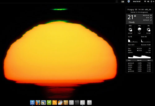
This process is controlled by the Variety application. You can change the timing interval and other options for the background images in the Variety Preferences panel.
The desktop itself is clutter-free. No icons can be placed there. The only item displayed is the Conky system monitor on the right side of the screen. It shows CPU, RAM, disk and other information.
Limited Desktop Functionality
The Gnome 3 desktop strives for simplicity. Functionality suffers.
A panel bar sits at the top of the screen. It holds the traditional menu button in the left corner and system notification icons on the right half of the bar. You can not add or remove any items from this bar.
A vertical Docky bar slides out from the left screen edge when you move the mouse pointer there. There’s a modified Docky launch bar instead of a bottom panel bar.
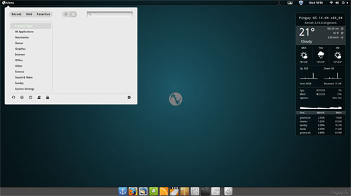
The Gnome desktop uses a full screen display to show installed applications. Right-clicking on an icon places the launcher on the Docky bar as a favorite item. An icon on the Docky bar lets you make some limited configuration changes.
Stock Software
No quick-start software options are provided for other browser choices, so you have to install what you want through the Ubuntu Software Center or the Synaptic Package Manager.
The only Web browser preinstalled is Firefox, but it includes numerous plug-ins by default. The LibreOffice suite also is provided by default.
Game availability is a weak spot on most Linux distros. This distro takes a minimalist approach. No games are preinstalled. However, the main menu provides a launcher for the PlayOnLinux and the Steam websites.
The other standard menu categories have a spattering of typical Gnome applications. If you are not familiar with these stock desktop titles, you no doubt will opt to replace them with your preferred computing software.
Ready to Go
Pinguy OS caters to the Gnome application standards, but the developer has added repositories and enhancement packages, which provide more software flexibility than the more limited Gnome options.
For most users, the tweaking offers most, if not all, of the packages needed to enjoy video, music and Web content. Some of that success comes from Flash and Java plug-ins already installed.
So you will not have to add extra codecs or specialized software and then struggle to configure them. This all contributes to a pleasant user experience from the first time you run Pinguy OS.
Bottom Line
Pinguy OS may not satisfy power users who like to control navigation with keyboard shortcuts and advanced system settings. However, if you are a normal computer user who just wants your system to work from the start, Pinguy OS has a lot going for it.
This distro is easy to misjudge as being too basic for serious users. I found it much easier to use than other desktop environments. I also found it much less frustrating to set up. There is little to do but launch your applications and go about your computing tasks.
My only dislike is based on my work routine preferences. I run numerous programs categorized on as many as four or five virtual workspaces. I switch among them continuously.
That does not happen conveniently here. The blame falls to the way the Gnome desktop is structured. Pinguy OS is merely the delivery vehicle. The developers have pushed the envelope as much as the Gnome architecture permits without stuffing a separate user shell on top of Gnome like other distros do.
Want to Suggest a Review?
Is there a Linux software application or distro you’d like to suggest for review? Something you love or would like to get to know?
Please email your ideas to me, and I’ll consider them for a future Linux Picks and Pans column.
And use the Talkback feature below to add your comments!












What the heck is going on here!!?? 70% of info in this article is just plain garbage, full-stop.
Yes, Pinguy OS is based on Ubuntu’s 14.04 LTS release. That was a typo on my part when I entered the information.
You asked me to expand on my statement that the Pinguy distro may not satisfy power users who like to control navigation with keyboard shortcuts and advanced system settings. You mentioned that these advanced controls are readily available in Pinguy OS as it is any other distro.
If you are familiar with other Linux desktop environments, you know that different desktops provide users with a varying degree of configurable settings to navigate the desktop with mouse clicks, keyboard shortcuts, hot spots at different locations on the screen edges, etc. Pinguy OS lacks this degree of functionality. That is what I meant when I said that experienced or power user might not like the lack of controls with this distro.
You also questioned my reference to newer desktop environments and suggested that Gnome 3 was equally new. That is not the case. Pinguy OS uses the latest release of the Gnome 3 desktop. One of the "limitations" of Gnome 3 is in how it lets users handle virtual work spaces. For instance, you must access the slide out panel from the right screen in Pinguy OS by pressing the Flan or Windows key. That exposes two default work spaces that you must click to switch desktops. Users are limited to these two virtual work places. Some — but not all –desktop environments let users set up as many as 110 virtual work spaces and switch among them by clicking a switcher placed on the panel bar. Other features let users set up keyboard combinations to move from one workplace to another.
Gnome 3 does not let you do this. All desktops are not created with equal functionality. Depending on the desktop environment supported by the Linux distro, the user interface will be different and will operate differently. Thus, Cinnamon is different from Xfce, LXLE, Unity and KDE, just to mention a few of the more popular desktops.
Your final point questioned my description of the default file manager in Pinguy OS. I did not say it was not Nemo. It is. But Nemo lacks some of the functionality of other file managers. That is why I suggested adding Nautilus if for no other reason having the ability to view two panes rather than one.
I feel the need to point out the inaccuracies and misinformation in this article.
1) you said: It may not satisfy power users who like to control navigation with keyboard shortcuts and advanced system settings
Q) Can you expand on the above? As I assure you all the above is as readily available in Pinguy OS as it is any other distro.
2) This approach may disappoint those who favor newer user interfaces
Q)Gnome 3 is a newer interface, even Cinnamon is just a fork of Gnome. So what do you mean by newer interfaces?
3) Pinguy OS is based on Ubuntu’s 12.04 LTS release.
Q) Where did you get that infor from? Pinguy OS 14.04 is based off of Ubuntu 14.04 LTS.
4)The default file manager is the Gnome Files 3.10.1
Sorry, the default file manager is Nemo.
"The Gnome 3 user interface is a bit clunky compared to some of the newer desktop interfaces populating Linux distros."
I’m sorry, what newer interfaces?
OK, maybe Deepin, Elementary, Pantheon, Cinnamon, but most of these are reactions to Gnome 3’s ‘new’ interface.
When did a ui that has upset so many with it’s ‘new’ ui, and breaks all its themes and most of its addons on every releasse become old…