![]()
PYKL3 Radar, an app from PYK Consulting, is available for US$9.99 at Google Play.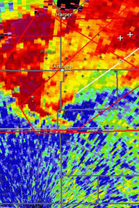
If you’ve ever been frustrated by the inaccuracy of a television weather report, in particular the graphics, there’s always been a way out — and that’s to go to the National Weather Service website and look at the online radar images pulled straight off the actual radar.
If you’re fishing, hiking, or working outdoors, though, you’ll find the NOAA-supplied desktop PC-designed graphics don’t render all that well on mobile devices, meaning you can get wet. The official mobile version is limited.
However, there is a solution, and that’s to purchase a dedicated NEXRAD Level 3 radar app. I took a look at one, PYKL3 Radar, and liked what I saw.
About Radar
Weather radars bounce radio signals off particles in the air. This is called “reflectivity” and is the foundation of a radar image. The colors you see on the map represent different strengths of reflected radio waves — different densities of rain.That’s basically it, although there can be various flies in the ointment.
For example, the particles causing the reflection could be birds, dust or insects, and not rain; and the angle of the beam caused by the earth’s curvature, elevation and distance can get an interpretation squirrelly — which is why forecasters go to school before we start paying them with out tax dollars.
However, if you’re serious about outdoor activities, in particular staying dry, it’s worth getting the tools and learning a bit about it. The National Weather Service provides an easy-to-understand tutorial that’ll get you up to speed on radar reading techniques if you’re unfamiliar with it all.
First Impressions
After loading this expensive app — $9.99 in the Google Play Store — I immediately realized that this was the real deal, not the tarted-up local TV, or consumer weather app version of a radar image.
Consumer products smooth the radial image creating a more aesthetic, but less detailed map. PYKL3 Radar shows true base reflectivity, with accurate, blocky pixels.
Putting It to the Test
I chose the KRAX radar in the Raleigh-Durham area to test. This was a spot where I knew a storm was pummeling through at the time.
I compared the PYKL3 Radar images to the official Weather Service images and wasable to verify that both the Base Reflectivity product and One Hour Precipitationproduct were in line with the official images — and were not the namby-pamby whitewash seen elsewhere.
To be fair, those whitewashed images are acceptable for seeing where it’s raining atthat moment, but they are unsuitable for weather geeks because you can’t drill down and see nuances like tilt angle. Viewing different tilt angles helps determine storm structure and should let you make sounder judgments.
PYKL3 Radar is spot on in providing accurate non-smoothed images and animations that would help a novice determine storm location, and it also provides the serious radar products required by storm chasers, storm spotters and forecasters.
Weather pros use the work “product” to describe a deliverable — like a type of weather radar image, or a type of forecast.
Further Details
As you might expect with this pro-level app, products include all of the National Weather service WSR-88D radar images, plus FAA Terminal Doppler Weather Radar found at airports. Optional paid subscriptions to various commercial products — like lightning — can be plugged in.
Neat, unexpected bonuses include the ability to layer radar images; ground-leveltemperature and wind observations; a national image; and most importantly, the ability to toggle between neighboring radars. Comparing adjacent radar images is an important part of the toolbox.
Not Perfect
My one criticism is that a Google Maps or similar option has not been incorporated into this app.
We’ve gotten used to seeing radar superimposed on sophisticated maps — albeit asa digest, as discussed earlier — but why not incorporate the various super-accuratereflectivity products into a street level map?
Classic radar map labels, like those in PYKL3 Radar, are limited to major highways, coasts, county lines, and so on. How hard can it be to take that data and dump it into something graphical at street level?
Overall: After a week of late-summer, 100-degree-plus temperatures here in Southern California, with PYKL3 Radar now loaded, bring on the rain I say.
























I’ll take a minor exception to the note on GoogleMaps. They’re pretty, but if you didn’t like smoothing on your radar images, do you like smoothing on your maps? Because of the origins of the data for Google’s map offerings, there are problems with edge matching and overlap that result in significant cartographic errors (assuming you’re also a GIS geek). I’m happy with the provided Shapefiles that come with the data although they are admittedly sparse. But it’s a tradeoff between pretty and better quality.
Overall, I love the app. I have it on my Toshiba Thrive and have it up in the office whenever we’ve got severe weather brewing, and it’s in the car with me when chasing.