One of my biggest concerns when I adopted the Linux OS over Microsoft Windows was Linux’s ability to supply me with a robust presentation program. I did lots of lecturing and instructional seminars. Those activities required a product that closely mimicked Microsoft PowerPoint quality. The resulting file also had to be compatible with PowerPoint.
My first foray into a replacement for the Microsoft Office suite of which PowerPoint is an industry staple was the close look-alike bundle from OpenOffice.org. Its presentation module, called “Impress,” did a great job of doing exactly that — impressing me.
Impress let me work much the same as if I were still using PowerPoint. It botched some of the display elements when viewed in PowerPoint, however. But if I avoided the really fancy stuff in my slide designs, I got few complaints from colleagues who imported the Impress presentations in Windows.
Two other Linux apps give you different options for working with presentations. An alternative to OpenOffice’s clone app of PowerPoint is the module bundled in the KDE Project. KPresenter is a full-featured app with fewer bells and whistles.
Impressive is an app not part of an office suite project like OpenOffice and KDE Office. It does not create presentations. Rather, it takes whatever format you built in other presentation software and displays it with a style all its own. I use Impressive to add some finishing touches to my presentations. If colleagues want a copy of my presentation, I export the file in PDF format.
Starting to Impress
The OpenOffice Impress module is a good starting point for Linux presentation software. It is convenient to get. If you have the OpenOffice suite, then you do not have to install a separate application. But you load Impress as a standalone tool, so it is accessible even without loading OpenOffice Writer.

Another good point about Impress is familiarity. If you know how to use PowerPoint, Impress has an almost identical look and feel.
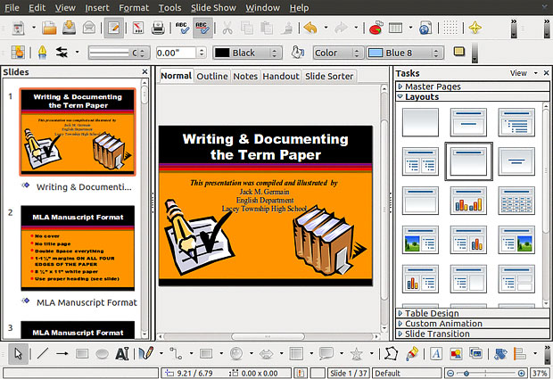
OpenOffice Impress has a three-panel interface that makes many features and tools a click away. Atop these three panels reside the traditional menu row and two rows of icon-driven design tools. Yet another row of icons reside across the bottom below the three panels. These tool icons let you quickly select design options for displaying content in a slide.
Getting Started
These options include creating shapes, colors, symbols, block arrows, stars and text boxes. You can also click icons to import photos and other graphics from files. These icons are a handy way to speed your way through a design project. It eliminates the need to find the same functions in the overlapping drop down menus.
A thumbnail view of each slide displays vertically on the first or left-hand panel. The second or middle display panel shows the selected slide’s content. Change the view in this middle panel by clicking on five tabs. These views are Normal, Outline, Notes, Handout and Slide Sorter.
The third or right-hand panel offers five more slide creation options called “Tasks.” The default display shows 23 layout choices. Click on the Master Pages bar to see thumbnails of page layouts used in the current presentation, recently used designs and layouts still available for use.
Task Tangents
Impress’s Task panel also offers numerous choices of Table Design styles, Custom Animations and Slide Transitions choices. A check list lets you further refine what types of columns you want displayed in tables.
The Custom Animation sub panel works by clicking choices for slide effects, slide properties and animation speed. Three buttons make it easy to Add, Change or Remove various slide effects.
A similar click-to-choose interface lets you select from a dizzying array of 56 slide transitions or no transition. You also can adjust the transition speed to Slow, Medium or Fast and add sounds from a catalog of 25 offerings. Do not forget to select whether the effects should occur on a mouse click or automatically after a specified time interval.
You also can select whether the transition is for selected slides or the entire presentation. If you check the Automatic preview box, you can see in the center panel and hear each selection’s effect.
Bottom Line
OpenOffice Impress is a heavy-duty presentation creation tool. Its operations are intuitive, and it readily accepts PowerPoint files.
KDE App Maybe OK
I usually have a stronger reaction to K Desktop Environment (KDE) apps in Linux. Sorry to say, KPresenter is less appealing to me. That is my first impression, however.

After working with this slide builder app for several work projects, I warmed up to its interface a little bit more than I expected. But the usual spit and polish that I see in other KDE apps just is not so shining in this one.
KPresenter has a powerhouse of tools for designing and refining slide show presentations. Finding and applying the right ones, however, presents you with a moderate learning curve.
Interface Woes, Not Wows
The concept behind KPresenter’s interface is similar to that deployed in Impress. But its execution falls short.
For example, starting a project with a blank slide in KPresenter is daunting. The app expects you to open an existing project file. Clicking New from the File menu mere opens yet another file structure screen with choices for Recent Document, Open Document and Screen. You have to select Screen and then click the button in the far right bottom corner labeled “Use This Template.”
The only template options are called Empty and Empty 16:10. After this step is accomplished, a blank creation screen appears. Then you can click on a limited offering of slide layouts to begin slide construction.
Slide Building Suffers
The interface is much less user-friendly than the OpenOffice version. While KPresenter employs a three-panel display, the similarity ends there.
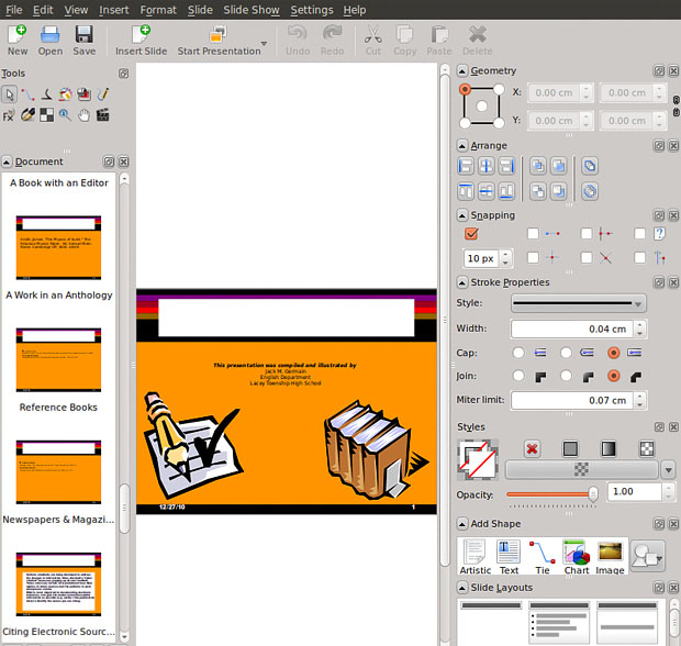
The left panel squeezes slide thumbnails, navigation buttons and icon-driven tools together. The traditional menu row sits across the top end of the app window. A tool bar resides under the menus.
The center panel shows the slide under construction. The WYSIWYG (What You See Is What You Get) behavior of this display is much less responsiveness than Impress’.
The right-hand panel has limited offerings of design and task options. The various tools are arranged laterally, but there is little apparent rhyme and reason to their placement. Unlike Impress, the tools are not separated by clearly discernible task categories. And some key feature controls such as animations are not included.
Can You Find It?
Forget about using a Help database to search for information about using KPresenter. No documentation is available within the program. Ditto for finding anything helpful on the KDE Project web site.
I tried to find where to look in the menus for the animation controls. Apparently there are none, not even hiding under configuration options. Some of the controls not available in the right-hand panel are hidden within drop-down menus. But not all.
This lack of feature accessibility is a major drawback to using KPresenter. The right-hand panel is filled with snippets of design selections. But the available options are always limited, so it takes longer to complete your slide presentation and you have to settle and compromise.
Bottom Line
KPresenter is frustrating to use. It looks feature packed, but it lacks a lot of useful choices. You can use it to create substantial slide shows. But you have to do it with a lot fewer choices.
Impressive Works
One way to compensate for the shortcomings in KPresenter is to build your basic content slides and then let Impressive add the eye candy and missing glitz. Impressive can add some additional glitter to presentations made with Impress as well.

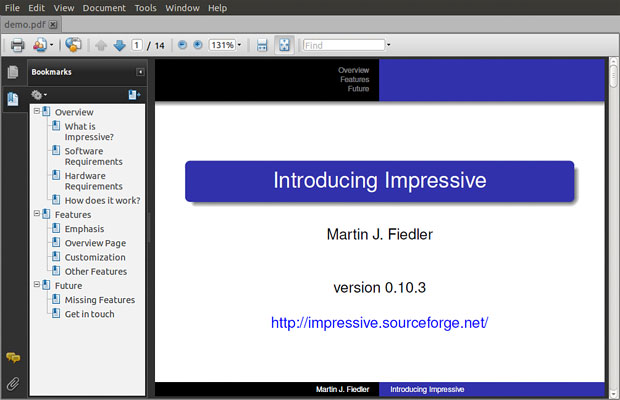
Impressive is an app that displays presentation slides. But it is much more than a player app. Instead, consider it a second level of slide building.
It lets you add alpha-blended slide transitions. Granted, all this does is hype the eye candy. But for those in your audiences who have seen one too many PowerPoint presentation, this higher-level sugar coating will be much appreciated.
But wait, there’s more: Impressive has some tools you will not find in other presentation creation applications.
What It Does
With Impressive adding a polished layer to your slide shows, the unique offering of page transitions can maintain audience attention. In addition to “impressive” new transitions, this app also gives you an overview function to refocus the audience.
Create an overview display during your live presentation. Hit the Tab key to zoom out the current slide to reveal in its place a thumb nail grid of all your presentation’s pages. Just click on a page to zoom it back.
To respond to questions or provide additional elaboration as you make your presentation, use the highlight box feature. It is easy to do. Drag a rectangle on the screen while holding down the left mouse button. When you release the button, the unselected portion of the screen darkens and blurrs.
You can create multiple highlight boxes per slide. Right-clicking on each box removes it. When no boxes remain, the entire screen resumes normal display. Press the S key to save box positions and reuse them in later presentations. This approach can go a long way to enhancing your public speaking effectiveness using the slide show.
Bottom Line
You have to use another application to create the slide presentation. But Impressive changes the dynamics so you can do more than parrot the content of each slide. Careful — it can be awkward to install outside your distro’s resident package manager. But it is available through the Synaptic Package Manager as an alternative.


you forgot ease:
http://www.omgubuntu.co.uk/2010/11/ease-clutter-presentation-app-linux-ubuntu/