
![]()
The recent release of Ubuntu 12.10, aka Quantal Quetzal, is a more palatable version of the open source OS built around the Unity desktop environment.Perhaps I am growing more accustomed to Unity, or maybe Canonical’s developers are succeeding in refining the graphical user interface, so it seems less objectionable for me to use.
In my view, the switch to the Ubuntu-specific Unity shell has not been Canonical’s finest hour. It did succeed in pushing me as a long-time user to other Linux distros. More times than not, when I return to Ubuntu, I run the KDE interface.
At least enough kinks in Unity are smoothed out enough that I can function more efficiently with it and maintain my near-normal work routine. Clearly, the default version of Ubuntu 12.10 with Unity is more mature than previous versions.
Feature Fixes
This latest Ubuntu version comes with just one flavor of Unity, the 3D version. Ubuntu 12.04 offered Unity 2D for hardware than lacked graphics acceleration. Ubuntu 12.10 has been tweaked enough for the Unity shell to run on both accelerated and non-accelerated hardware.
The Unity Launcher also shows a hefty finessing — this is the icon bar that is hard-wired to the left edge of the screen for launching frequently used applications. Its displayed icons are more appealing visually with their rounded, uniform appearance.
I like how the icons for launched apps are bracketed and change color slightly so I can tell at a glance what I have running. I also like how the icons collapse when scrolling through a long list of favorite apps placed on the Unity bar. This shrinking trait also works when I choose larger icons for smaller laptop screens.
The ability to hide the Launcher bar until the mouse pointer touches the left screen edge makes the Unity icon row less annoying. These are not a new features for the Unity Launcher, but they work much more smartly than in previous versions.
Dash of Disdain
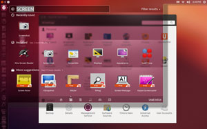
When Canonical first introduced the Heads Up Display a few versions ago, I was intrigued by its novelty. It has now morphed into what Canonical calls the “Dash.” I find working without a traditional pop up or drop-down menu to be more of a hassle than it is worth.
I still like the concept of having a transparent search panel to quickly locate files and content in one place on my screen from local storage and the Web. However, having to type an application’s name, even a portion of it, rather than clicking on a program name or icon is far too distracting. It breaks my work flow.
As a work-around, I pile icons for occasionally-used apps onto the Unity Launcher. I find this a better alternative to scrolling through an extended list of applications that the Dash “thinks” I might want to use.
A more ideal solution for my liking would be the ability to have an application menu separate from the search-to-launch approach of the Dash. The remaining Dash functionality would be a better tool for searching.
Solidifying Searches
Much as the Unity shell is the distinguishing trait of the Ubuntu OS, the Dash is the primary focus of Unity. It is perhaps the feature that received the most improvement over version 12.04.
The Dash replaces the traditional search window in the user interface or desktop shell. Performing a search displays both local storage media and Web results. This takes an adjustment in computing behavior.
For example, searching for an item, be it a song title or document or photo, brings up all relevant hits as well as any items fitting the search criteria from Web download or streaming sources. This feature can be disabled in the settings panel.
Search integration is the obvious goal. The Dash acts as an aggregation center for finding content in all of your online accounts. Search results integrate with Google Docs and the Ubuntu online music store.
Web App Workout
A new twist in this latest Ubuntu OS is the integration of a Web browser. It treats online services as a desktop application.
This lets you place a service such as Gmail or Facebook as an active display in its own window. A preview feature with a right click on an icon gives you a full-screen view of information about it.
The feature might be Canonical’s answer to the new GUI Microsoft Windows introduced in the Windows 8 OS with large tiles holding active content from running applications. The WebApp infrastructure needs to grow before it can become a killer feature.
How does it work? A limited number of websites so far offers these browser extension-like applications. You visit a participating website and accept the offer to automatically install a Web app.
Feature Failures
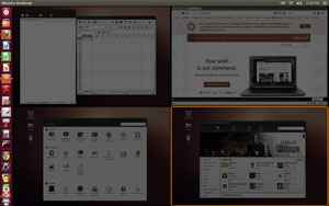
I relish the use of workspaces. Unity makes that process an unnecessary chore.
For example, the workspace switcher at the bottom of the Unity Launcher: The super key (dedicated Windows flag key on most keyboards) opens and closes the Dash.
Hand-on-the-keyboard navigation is easy enough to do, but no similar key combination launches the switcher.
Similarly, Ubuntu 12.10 lacks any durable method for creating keyboard shortcuts to navigate from workspace to workspace. It also lacks any keyboard shortcuts to send running applications to a designated workspace. Only right-clicking on the top border of an open window provides that control.
Bottom Line
The Unity way of computing still is not for all experienced Linux users. If I were a newcomer from the Windows OS, I would find the lack of menus and the other shortcomings too much of a barrier to switch.
I also do not like the growing tendency that Canonical is building into the OS to sell apps and other items, both through its own Ubuntu One cloud storage and its partnership with Amazon.













"Unity Just Sort of Grows on You"
So do warts, corns, calluses, and tumors. That doesn’t mean I go around bragging about any of them.
Linux Mint Debian’s Mate desktop hasn’t had to "grow on me" – it just worked out of the box. It’s very much like what I’m used to, and it works. I’ll pass on Unity, Gnome 3, and any other "Metro" designs.
This is what exactly I was searching, the information was overall very useful for me, thanks a lot.
Ubuntu does have expenses, such as paying for codecs, paying for programmers, paying for distribution and so forth. Ubuntu is partially a charity distribution– you can get it for free,
but the bills have to be paid, and so, Canonical is doing the next best thing… Selling via a Ubuntu store, and offering cloud storage for a very small fee.
Nice article. You did miss some things about Unity, however. To access the workspace switcher, just hit "windows+s", and to jump from one workspace to another, it’s "ctrl+alt+arrow key", where arrow key is the direction you’re trying to go. Not only this, but all the unity shortcuts are listed if you hold down the windows key.
Apparently you have not read the far-less-than-complimentary review of Shuttleworth’s latest, um, offering–which was hailed by obvious cult members as being really objective: Issue 480 (2012-10-29): ‘Review of Ubuntu 12.10’, by Jesse Smith, DistroWatch MAGAZINE.
The ‘fans’ (short for ‘fanatic’, as we all know) were astoundingly quiet; the silence was, as they say, deafening.
Check it out.