
![]()
Canonical will release its upgrade to Ubuntu 11.10 on Oct. 13. If you suffered through version 11.04 in hopes that something better would arrive in 11.10, you suffered in vain. For the typical user, very little of anything new is bundled into this latest Ubuntu upgrade.
To be honest, my early hands-on experience with Ubuntu 11.10 did not disappoint me — not really, anyway. I was not expecting much in the upgrade. Not much new is precisely what I found. But let’s put my reaction in context. I am a die-hard Ubuntu user. Version 10.10 (not 11.04) is one of two Linux distros dual-booted on nearly all five of my desktops and laptop computers.
Canonical’s decision to build new releases around its Unity interface, coupled with drastic changes in the look and feel of the Gnome desktop, left me feeling glum with Ubuntu’s changing user experience. Version 11.10 is not making me feel any happier about Ubuntu.
With today’s computers, it should be all about the apps they run and not the OS that runs them. But the OS should embellish a happy user experience. For me, the new GUI (graphical user interface) just gums up the works.
Good With the Bad
That does not mean that nothing good is included in the newest Ubuntu release. File-sharing and personal cloud storage just got a whole lot more convenient.
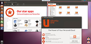
Canonical stands an excellent chance of attracting new adopters. Ubuntu’s redesigned software center (aka “package management system”) and the expanded free Ubuntu One cloud storage service are attractive draws.
Canonical deserves credit for beating Apple’s iCloud out of the gate. I am much more impressed with the cloud offering in this release, as well as the fine-tuning done to the music download store integrated within Ubuntu One.
Dyno Details
The integrated Ubuntu One service lets users stream music from their personal Ubuntu One cloud to Android devices and iPhones. Even better, they can easily share files with Windows computers. But to enjoy this feature, you have to run Ubuntu 11.10. Earlier versions do not have the same degree of integrated features.
Ubuntu’s designers gave the Software Center a major remake. Its new design makes finding software based on ratings and popularity easy. And users can chime in with their own reviews much like in Android app virtual stores.
Ubuntu’s heftier personal cloud puts user data at the fingertips regardless of computing platform. For example, you can stream your entire music collection to all your devices. You can also access and share files, documents and photos online with Android and Windows machines. The service comes with 5 GB of free storage available to every Ubuntu One subscriber.
More Good Stuff
Ubuntu 11.10 uses an enhanced central search-driven interface called the “Dash.” It now provides instant access to your personal and online music collections through the music lens, which will also search the Ubuntu One Music Store.
This feature also provides instant access to Last.fm, the Amazon MP3 store and a growing collection of free content available from the public domain and open licenses. Another nice touch is that Ubuntu users no longer have to hunt for top programs to enhance default offerings.
For example, Ubuntu 11.10 comes comes with pre-installed Deja Dup, a full backup facility. It is integrated with the Ubuntu One cloud. This lets you schedule backups and restore content almost effortlessly.
This latest OS upgrade replaces some traditional Ubuntu default applications with more popular choices. For example, Mozilla’s cross-platform Thunderbird is the default email app. Evolution is available as an option for download. Banshee is the new default music player, and Shotwell replaces GIMP as the photo manipulation tool. LibreOffice replaces OpenOffice as the office suite.
Uneven Upgrade
Since I filed this column two days before the official launch, Canonical gave me the final release candidate version of Ubuntu 11.10. Ubuntu’s developers were still making minor tweaks to the release code due out on Oct. 13.
A normal upgrade handled through the Ubuntu repository might not have the complications I met. Any thoughts I harbored about Canonical finally smoothing out the installation process for virgin installs were quickly dispelled by my manual installation experience.
Normally, downloading an ISO file and burning an installable CD from it is a no-brainer. But the ISO file was filled with glitches. I tried several computers and redid the process a half-dozen times. In every case, the checksum failed. That meant the installation faltered. Finally, I was able to get an uncorrupted ISO file to burn without errors to a CD. But more problems marred the installation.
I had to use a several-year-old large-screen HP Pavilion laptop. The installation CD would not work on my other desktop and laptop configurations.
Up and Running
I let the installation process resize the laptop’s hard drive. That let me retain my existing Ubuntu version and modify the existing dual-boot option to run the upgrade. But the hardware setup met with several failures. For instance, the touchpad did not work initially and wireless connectivity was disabled.
After swapping out the Unity desktop for the Gnome 3 shell, some wireless access returned. The network settings in the system controls listed both the internal wireless circuit as lacking needed firmware and the wireless PC card as nonexistent. But both still worked on the earlier installed version.
Ubuntu infamously relies on activating proprietary drivers after installation is completed. In this current upgrade, only one was offered. The switch to Gnome solved the PC card wireless issue. But the bogus firmware issue remained.
A Shell of an Interface
After installing the Gnome 3 shell from Ubuntu’s Software Center and rebooting, I selected from five options by clicking the gear icon next to my username in the password windows. The choices are: Gnome, Gnome Classic, Gnome Classic (no effects), Ubuntu (Unity) and Ubuntu 2D (for hardware-challenged computers). These various options are geared toward different graphics and hardware capabilities.
Happily, switching to the Gnome shell and rebooting solved the touchpad problem. Several previous reboots under Unity failed to turn on the touchpad.
Gnome 3 is a complete remake of Gnome 2. So even though I am fond of the Gnome desktop, I was in strange territory trying to navigate around this new interface. I had played around with an earlier version that Canonical made available when it released Ubuntu 11.04. But the additional tweaking by the Gnome developers turned the new Gnome shell into a much different entity.
Unity vs. Gnome
The Unity interface does away with the classic GNOME panel. A similar panel is still on the top edge of the screen. But it does not function as a launcher dock.
The Unity menu bar is a vertical panel on the left edge of the screen. It combines what used to be the separate functions of the Ubuntu menu button and the panel. It shows icons for some system functions. Also, you cannot minimize or maximize open windows in Unity.
The Unity interface resembles a tile system. Unity lacks Alt/Tab window switching functionality. Instead you navigate by clicking large thumbnails of running apps. Similarly, you move among virtual workspaces by clicking a mini view in a grid of the workspaces.
Functional Folly
By comparison, Gnome 3 has a limited use panel at the top of the screen. Some notifications occur there, but it is not a launch bar for favorite apps. Two views are available by clicking the Windows label or the Applications label at the top of the screen.
The Windows view shows a vertical menu bar along the left edge of the screen. It resembles the Unity menu bar as an icon holder for quick-launch apps and open windows. A vertical panel along the right edge shows the virtual workspaces.
The Applications view displays all of the installed programs, much like the display on a tablet or smartphone. The vertical pane on the right side changes to a list of menu categories. The left-hand pane remains unchanged.
Gnome Home
The Gnome interface makes it easy to drag several open windows from thumbnails to the main display or workspace. You can then resize individual windows by dragging corners with the mouse pointer. You can also reposition these open windows.
Clicking on one of the windows enlarges it so you can work in that application. Put the mouse pointer in the upper left corner of the screen to have all open windows return to uniform size between the left and right reappeared vertical panels.
Return the mouse pointer to the upper left corner of the screen to have the open windows resize. The application that was last being used pops to the foreground as the active window.
Pressing the Alt/Tab keys simultaneously pops up a window selector. This is as close to Alt-tab window switching as it gets.
No Easy Choice
I kept Ubuntu 11.04 on one of my desktop computers and skipped that upgrade on most of my other gear. But I reverted to the Gnome 2 shell instead of keeping the Unity shell. I did something similar when I upgraded Ubuntu on my netbook last cycle. Instead of running the Unity shell, I installed Xfce. That played much more nicely on the tiny screen and avoided the tile approach that Unity pushes.
But when the long-term support ends for my installed versions of Ubuntu 10.10, I will face a true computing dilemma. My return to Unity in the initial installation of version 11.10 renewed my distaste for the Unity desktop. But Gnome 3 is so radically different that I might have to struggle in adapting to it as well.
I have not seen any versions of Xfce packaged for Ubuntu 11.10 yet. That could eventually be a good fix for my notebooks and netbook running Ubuntu 11.10. But I think it is far too simple for the expanding real estate on my large-screen desktop configurations.
I even tried to settle into using the KDE desktop. I liked KDE 3. But when the K community pushed out KDE 4, I gave up on it.
Bottom Line
The addition of the new Gnome 3 shell in Ubuntu 11.10 forces a paradigm shift in your computing habits. Both the Unity desktop and the new Gnome shell force you to accept radical changes if you decide to stay with the Ubuntu philosophy.
It could well come down to your personal desktop preferences if you stay with Ubuntu. The Ubuntu One cloud services may not be enough of a useful attraction to keep you from seeking another Linux distro. Ubuntu 11.10 may not offer something for everyone.














i like unity and works great on my netbook and desktop. the side bar is best on my netbook and does not take up vertical space.
(but if you like it at the bottom for any reason there are some tutorials for that online)
i think this shell is better for canonical in the long term.
am sure "kde5 and gnome4" will break the desktop once again in the future.
so this lets them keep something stable for as long as they like while adding improvements every 6 months.
Maybe someone can explain this to me. pretty much EVERY device out there is widescreen now, from the 7 inch netbooks and tablets, to the 12 inch netbook/ultraportables like my new EEE, to the big 17 inchers, to the desktops. ALL are widescreen. So what in the name of all that is good and holy possessed them to put the stupid bar going up to down?
It is pretty obvious on any widescreen not in portrait mode (which with the exception of a couple of graphic artists everyone I’ve ever met sticks to the default landscape) that you will have the most room going left to right NOT up to down, so what gives? do they think Linux users will only use a couple of programs?
I just don’t get it, but then again frankly i think all the DE devs have taken a detour to nutty town. KDE 3 was nice and light, GNOME 2 while a little too "Mac-ish" for me was also nice and pretty light, but now everyone seems to be taking a page from the MSFT/Apple handbook and saying "Bring on the bling!" not to mention throwing out working code for buggy. its like some bizarro world where the devs go "Quick things am getting stable! Users am happy! Must break everything and make real slow and flashy, that’ll make users miserable!".
So honestly I don’t get it, nobody seems to like unity (it looks like it was made for tablets but like i said don’t seem to fit the tablet FF) and while some like KDE 4 and Gnome-SHell (although there seems to be more hate than love) just think how far along gnome 2 and KDE 3 would have been if that level of effort would have been put into them?
I swear if i didn’t know better I’d say its a case of fear of success and snatching defeat from the jaws of victory. Its like every time things start running smooth and stable it seems like a race to see who can break stuff first. its just nuts.
I’ve been using Ocelot for about 3 weeks now. I’ve not been able to get Gnome shell to install without it making a complete mess of my desktop. I’ve been using Unity quite a bit, however, and I am generally satisfied with it. But, like you, I find little to commend it over Unbuntu 10.10.
I have one specific comment in response to your report. You can minimize and maximize open windows in Unity. In maximized windows, the minimize and maximize buttons are located in what use to be the top panel in Gnome 2.0. In resized windows (i.e., less than maximized) the buttons are located in the applications’ title bar.