![]()
The Vivaldi browser provides a refreshing approach to traveling along the Internet. It offers something beyond the same old thing in a different skin.
Vivaldi is the brainchild of former Opera CEO Jon von Tetzchner. The developers built the Vivaldi browser on top of Chromium, which is open source, but added their own proprietary skins.
Therefore, Vivaldi’s code is not available for review, and that may never change, according to the company. The goal is to protect Vivaldi’s secret sauce.
That tiny licensing glitch aside, the Vivaldi browser has the same affliction as the Google Chrome browser, which is also built from the Chromium project: It is not completely open source.
That said, I am considering this latest cross-platform browser as pretty close to open source and thus a special candidate for Picks and Pans scrutiny.
It is available for Linux, Windows and Mac. It is not yet available for mobile devices.
Having a new Web browsing strategy available for Linux is a big win. Having Vivaldi available as a cross-platform application gives it one more benefit for enticing users who want to use the same application on multiple operating systems they use.
More Than Basic Stuff
The Vivaldi browser has a hefty set of features to its credit early in its development. That portends even better performance down the road and more reasons to adopt it. The release of version 1.0 ends a year-long growing stage from alpha through beta.
Vivaldi is a comfortable fit for users who do routine email and general online tasks, but advanced users who like to configure settings and make the look and feel appear their way no doubt will become its main user base.
Vivaldi is a tweaker’s delight. Add to that its Chromium base, and the result is a highly configurable Web browser that has access to nearly all your favorite browser extensions.
Usable UI
When you launch Vivaldi, it doesn’t look much different from any other modern browser. What separates it from the rest of the pack are all the little features tucked away.
The user interface takes a bit of orientation. Control navigation works differently than expected if you are familiar with other leading browsers. Once you adjust, however, Vivaldi presents a very workable interface.
I had to reorient myself to two major differences. One was the way the Bookmarks row works. The other was the radically different replacement for tabs.
Top-Down Layout
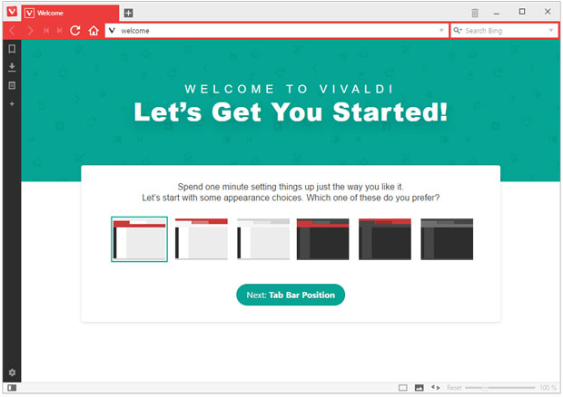
The Vivaldi Button in the upper-left corner of the browser window opens a drop-down menu for traditional command categories of File, Edit, Tools, Windows and Help.
Below that V button is a small space between the left edge of the browser’s window and the URL window is a few navigation buttons for back, forward, reload and Home window.
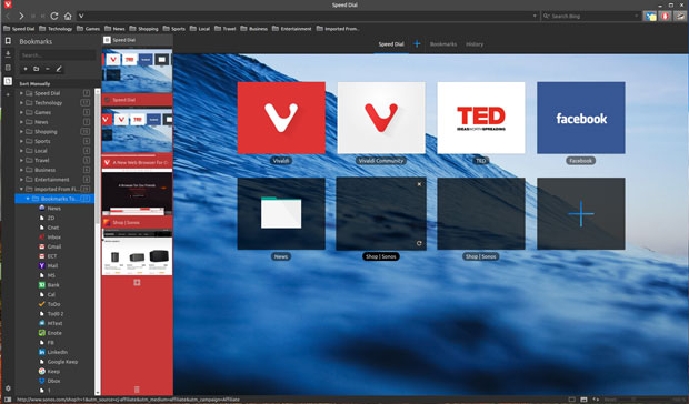
Under this second row is the bookmark row. There you find drop-down menus for numerous prepopulated categories such as Speed Dial, Sports, News and Imported From. You can add, rename, edit and delete the entries in each of these categories by right-clicking on a category item.
A Different View
In both the Google Chrome and the Chromium browsers, as well as Firefox, I am able to place my frequently used URLs in the bookmark row at the top of the browser window, giving me one-click access. That does not exist in the Vivaldi browser.
Instead, I had to settle for clicking on the traditional Imported From folder and browse through the list of my saved URLs. Another option is to display the bookmarks panel as a vertical display on next to the Windows panel.

The setting is in the Vivaldi/View menu. Many of the actions accessible from the Vivaldi menu also have keyboard shortcuts if you bother to learn them. You also can customize keyboard shortcuts by going to the Keyboard tab in Settings.
Having one or both of these panels opened consumes real estate for the opened URL window, so you have to rethink how much convenience you want to compromise.
Totally Tabs
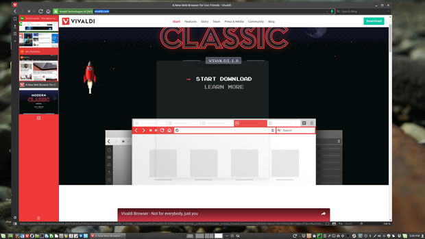
A thumbnail view of each open Window (think Tab) is displayed on either the left or right side of the screen as a vertical panel depending on how you configure Vivaldi. You do not have any tabs resting across the top of the browser window.
To close an opened window, click the X in the upper right corner of the thumbnail. You also can click the trash can icon at the bottom of the thumbnail panel and select the windows from the displayed list. To add a new window, click the plus mark at the bottom of the thumbnails or right click in a blank space in the thumbnail panel
How you work with windows/tabs in Vivaldi is much different from tab designs in traditional Web browsers. The intent of the new design is to eliminate the maze of open tabs that lead to frustration when looking for a “parked” tab.
In Vivaldi, you can group related windows together to reduce the size of the thumbnail list in the panel. Drag one thumbnail onto another one to group however many open windows you want together.
When you hover the mouse over a grouped thumbnail in the panel, a horizontal row of windows in that group is displayed over the open active window. It’s similar to working with virtual workspaces on the Linux desktop.
Right click on a thumbnail to open a standard menu of options. These include New, Reload, Clone, Pin, Bookmark and Close tabs.
More Features
The Tab Stacking feature isn’t the only innovation in the Vivaldi browser. Several more productive features are built in. One very useful feature is the ability to take notes within the browser using the note-taking tool in the sidebar.
To use it, just click the notes icon to start typing. You can organize notes into folders and add screenshots and attachments by using the icons at the bottom. The feature has nothing to do with annotating Web pages. The notes stay fixed as you move to another website. You can attach URLs for reference, and each note is stamped with a time and date.
Quick Commands (press F2) conducts quick Web searches and shows surfing history and bookmarks. You also can search for keyboard shortcuts and menu items. Vivaldi gives you mouse gestures, a feature you usually don’t have in mainstream browsers.
I like the ability to split screen when I use a word processor or text editor. Vivaldi lets me browse side by side as well, making it easy to see multiple tabs. To use it, press the Control key and pick a layout. You can select a horizontal, vertical or quarter display.
Bottom Line
Once I got used to the different UI and adjusted my Web browsing habits, I liked using Vivaldi in extended Web surfing sessions. However, the browser is still young and has some glitches.
For instance, some of the extensions crashed when I tried accessing options settings. Sometimes when I clicked a thumbnail the browser unexpectedly closed.
All things considered, I can see how Vivaldi offers new and better ways of working online. I live in a Web browser with lots of opened tabs. For me, Tab Stacking is one of the best new features in any of the Web browsers I use.
Want to Suggest a Review?
Is there a Linux software application or distro you’d like to suggest for review? Something you love or would like to get to know?
Please email your ideas to me, and I’ll consider them for a future Linux Picks and Pans column.
And use the Talkback feature below to add your comments!


I initially had a similar problem where I had to double click on the imported bookmarks. All you have to do though is drag and drop’em out of imported into normal bookmarks, then deleted imported folder, when empty, and it’s no longer double-click! I am very glad to have been told about Vivaldi!!!