![]()
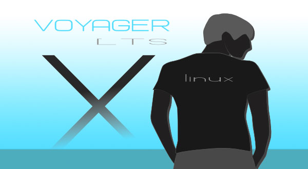
Voyager-X is a closely knit Xubuntu clone with a few impressive differences that set it apart from the typical Xfce desktop.Voyager-X 10.14.4, released in March, is based on Xubuntu/Ubuntu 12.04 LTS (Precise Pangolin). This new Voyager-X is one of the first distros to use the new Xfce 4.12 desktop, more than one year in the making.
Ubuntu has yet to implement it, and few other Linux distros have put the new update into play. Thus, the latest Xfce desktop is considered “experimental.” However, it is a fully functional upgrade.
Voyager-X adds to this the Linux kernel 3.16, for a faster and more responsive OS that is optimized for better performance and offers much improved hardware support.
Its desktop display includes an unusual tweaking of the Avant Window Navigator, or AWN. This is a dock-like navigation bar. I do not like the way AWN works in Voyager, however. Unlike other distros where I grew fond of this docking bar, I found its integration in Voyager to be clunky and mostly unconfigurable. It also has a flat design lacking any icon animations.
The desktop treatment includes a rather innovative use of Conky, which displays useful information on the desktop. Its integration in Voyager-X is highly adaptable, turning Conky into a dynamic element on the desktop rather than a static display.
Mixed Impressions
In the crowded field of mostly look-alike Linux distributions, developers need to be more mindful of branding and packaging issues that can detract from powerful first impressions. Sadly, this is an issue French developer Rodolphe Bachelart, the creator of the Live Voyager series, needs to give more priority.
For example, The Voyager web site is written in French. It provides almost no information about the operating system.
I slightly enjoyed the opportunity to remember my fuzzy French from high school and college — but the release announcement in French left too much to very loose translations.
It’s the little things that can accumulate and turn off potential faithful users. Take, for instance, sloppy consistency with product branding.
For example, the installation icon is labeled “Install Xubuntu 14.04.1 LTS.” Come on, guys. This is a reference to an earlier release of Voyager-X. Numerous labels and icons in menus reference Xubuntu. This carelessness creates confusion among users as to which product or distribution they are actually using.
Look and Feel
Another factor contributing to a poor first impression is the harsh look of the screen’s design. Default views are important. Users who try out a live session and see mostly washed out colors and flat images easily can assume the worst and move on.
The default background is mostly a combination of white shades and grays. One of the product descriptions claims that the release includes more than 300 photographs and animations that can be used as desktop backgrounds. That sounds lovely — but I didn’t find more than a few dozen images.
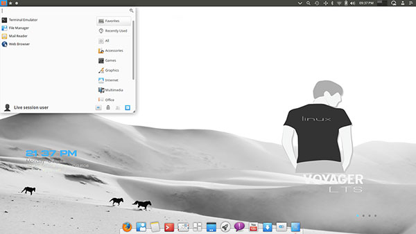
What I did see were mostly comprised of muted colors and dark shades of gray and black or white. The pictures were not overly interesting.
I admit that such poor window dressing does not affect the technical attributes of Voyager-X. Still, an operating system’s physical appearance is just as important as any workroom decor.
There is a positive side of the desktop appearance, though. It is easy to give each virtual workspace its own background and Conky displays.
Desktop Design
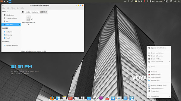
This new version of Voyager-X offers performance improvements and support for more hardware. This was my first look at Xfce 4.12. Its integration into the Voyager distro is different from what I expected. It did not seem like a retread of previous Xfce desktops.
In a throwback to more traditional Linux distros, the panel bar sits across the top of the screen. It holds an unusual collection of icons and notifications.
The far left corner holds three icons. A grid icon opens the Whiskers-style main menu. Categories fall into a vertical column on the right edge. The installed programs for a selected category form a line along the left edge. A Star icon opens basic home locations and favorite programs. A circle icon opens the full-screen Slingscold menu.
The center space in the top panel bar is blank. Icons for running programs take a spot on the left side of the bar. Icons for open system tools display on the right side of the bar.
The right side of the bar holds an eclectic collection of icons. A wide V icon drops down a dash or heads-up display with limited functionality. A spyglass launches the Synapse Application/File Finder. A left-pointing circular arrow launches a backup application. A headphone icon drops down a menu for Radio Tray controls. This is an online radio streaming player.
The Bluetooth icon drops down a controls menu for managing and connecting devices. Other icons show connectivity, battery and audio settings, as well as clock and calendar displays. A virtual desktop switcher is set by default to four workspaces. A set of traditional icons provides access to short-term weather forecasts and Session controls. The last icon launches a series of Personal apps that display a calendar, a sticky note and a calculator.
The Bottom View
The Plank is an AWN-style dock-like navigation bar at the center bottom of the screen. In Voyager-X, it functions more like a second panel bar but is less configurable.
This dock has preinstalled icons for Firefox, File Manager, Mousepad, Terminator, Thunderbird Mail, Skippy-XD, Showdesktop, Slingcold, Pidgin Messenger, SMPlayer YouTube Browser, Ubuntu Software Center, Settings Manager and Plank. Icons for open programs sit on the right side of the dock.
Most of these applications are fairly standard for the Linux OS. But Skippy-XD is much less traditional. When you click on the icon, the display shows a pulled-back view of the open application windows in the current Virtual workplace. This is similar to the Scale feature in other GNOME-based desktops.
A few of the icons residing on the bottom dock are a bit odd. First, the Plank icon merely opens the About Plank information window. It does nothing else.
Another odd thing is the absence of any control access to modify Plank settings. I scoured every one of the half-dozen separate settings-and-preferences tools in the main menu looking for access to the Plank configuration, including the Settings Manager icon on the Plank dock. I did not find one.
More Impressions
One of the most innovative desktop features is the pop-out panel from the right edge of the screen. This transparent panel displays two rows of eight launcher icons. They provide a wide range of functions that include a few settings tools, workspace switcher buttons and more.
Overall, this latest release of Xfce has far too many disjointed control apps and dizzying menu options. Compositing is enabled, but it does not have compiz-config installed. So, out of the box, you will not get much, if anything, in the way of desktop animations. That makes for a rather bland and uninviting desktop.
Thunar 1.6.6 is the default file manager. SMPlayer YouTube browser is similar to Minitube but opens youTube media files in VLC player. Unlike previous versions, this one lacks the Freetux TV application.
Voyager-X comes with the Kodi Media Center. Formerly known as “XBMC,” Kodi is a free and open source software media player and entertainment hub.
Bottom Line
If you want to take Voyager-X for a spin, you can download the ISO directly here. This link will remove the frustration of searching for the download location link on the poorly designed Web page with its mostly French content.
The Xfce desktop environment was long overdue for an overhaul. Its earlier versions were fast and efficient. That remains true with this latest Xfce release.
Want to Suggest a Review?
Is there a Linux software application or distro you’d like to suggest for review? Something you love or would like to get to know?
Please email your ideas to me, and I’ll consider them for a future Linux Picks and Pans column.
And use the Talkback feature below to add your comments!


